---
title: "Unequal Recreational Losses? Revealed Preference Evidence of Campsite Closures in Hawaiʻi"
format:
html:
code-fold: true # Enables dropdown for code
code-tools: true # (Optional) Adds buttons like "Show Code"
code-summary: "Show code" # (Optional) Custom label for dropdown
toc: true
toc-location: left
page-layout: full
editor: visual
---
This site provides a walk through on the results from Unequal Recreational Losses? Revealed Preference Evidence of Campsite Closures in Hawaiʻi. This tab covers the comparison by loading the data from the models. Tabs MDCEV and RUM are the codes that will run each model.
# Data
## Libraries
```{r, message=FALSE}
library(dplyr)
library(tidyr)
library(haven)
library(readr)
library(mlogit)
library(lmtest)
library(purrr)
library(stringr)
library(readr)
library(ggplot2)
library(stargazer)
library(readxl)
library(patchwork)
library(broom)
library(tidyverse)
library(sf)
library(tigris)
library(ggrepel)
library(ggspatial)
library(ggpattern)


final_comparison_master=read_csv("data/final_comparison_master.csv")


final_data_2018 <- read_csv("data/final_data_2018.csv")
final_data_2019 <- read_csv("data/final_data_2019.csv")
final_data_2020 <- read_csv("data/final_data_2020.csv")
final_data_2021 <- read_csv("data/final_data_2021.csv")
final_data_2022 <- read_csv("data/final_data_2022.csv")
final_data_2023 <- read_csv("data/final_data_2023.csv")

model_list_obs <- readRDS("data/model_list_obs.rds")
model_list_52 <- readRDS("data/model_list_52.rds")
```
## Welfare Table
```{r}
#| cache: true
# Calculate Mean and 95% Confidence Intervals
summary_wide <- final_comparison_master %>%
  filter(year %in% c(2018, 2023)) %>%
  group_by(parkname, year) %>%
  summarise(
    n = n(),
    mean_val = mean(loss_rum_observed, na.rm = TRUE),
    sd_val   = sd(loss_rum_observed, na.rm = TRUE),
    # Calculate Standard Error and 95% CI bounds
    se_val   = sd_val / sqrt(n),
    LCI      = mean_val - (1.96 * se_val),
    UCI      = mean_val + (1.96 * se_val),
    .groups = "drop"
  ) %>%
  select(parkname, year, mean_val, LCI, UCI) %>%
  pivot_wider(
    names_from = year,
    values_from = c(mean_val, LCI, UCI),
    names_glue = "{year}_{.value}"
  ) %>%
  # 2018 Stats then 2023 Stats
  select(parkname,
         contains("2018"),
         contains("2023")) %>%
  as.data.frame()
```
```{r}
#| cache: true
#| eval: false
stargazer(summary_wide,
          type = "html",
          out = "tables/Welfare_Comparison_Table.html",
          summary = FALSE,
          rownames = FALSE,
          title = "Welfare Loss: Mean and 95% Confidence Intervals (2018 vs 2023)",
          digits = 2,
          # Groups the 3 columns under each year
          column.labels = c("Park Name", "2018", "2023"),
          column.separate = c(1, 3, 3),
          covariate.labels = c("Park",
                               "Mean", "Lower CI", "Upper CI",
                               "Mean", "Lower CI", "Upper CI"))


# Calculate Mean and 95% Confidence Intervals
summary_wide <- final_comparison_master %>%
  filter(year %in% c(2018, 2023)) %>%
  group_by(parkname, year) %>%
  summarise(
    n = n(),
    mean_val = mean(loss_rum_52wk, na.rm = TRUE),
    sd_val   = sd(loss_rum_52wk, na.rm = TRUE),
    # Calculate Standard Error and 95% CI bounds
    se_val   = sd_val / sqrt(n),
    LCI      = mean_val - (1.96 * se_val),
    UCI      = mean_val + (1.96 * se_val),
    .groups = "drop"
  ) %>%
  select(parkname, year, mean_val, LCI, UCI) %>%
  pivot_wider(
    names_from = year,
    values_from = c(mean_val, LCI, UCI),
    names_glue = "{year}_{.value}"
  ) %>%
  # 2018 Stats then 2023 Stats
  select(parkname,
         contains("2018"),
         contains("2023")) %>%
  as.data.frame()
```
```{r}
#| cache: true
#| eval: false
stargazer(summary_wide,
          type = "html",
          out = "tables/Welfare_Comparison_Table_frequency.html",
          summary = FALSE,
          rownames = FALSE,
          title = "Welfare Loss Frequency: Mean and 95% Confidence Intervals (2018 vs 2023)",
          digits = 2,
          # Groups the 3 columns under each year
          column.labels = c("Park Name", "2018", "2023"),
          column.separate = c(1, 3, 3),
          covariate.labels = c("Park",
                               "Mean", "Lower CI", "Upper CI",
                               "Mean", "Lower CI", "Upper CI"))
```
```{r}
#| cache: true
#| message: false
#| warning: false
#| code-fold: true
#| code-summary: "Show the Code"
# Calculate Mean and 95% Confidence Intervals
summary_wide <- final_comparison_master %>%
  filter(year %in% c(2019, 2020)) %>%
  group_by(parkname, year) %>%
  summarise(
    n = n(),
    mean_val = mean(loss_rum_52wk, na.rm = TRUE),
    sd_val   = sd(loss_rum_52wk, na.rm = TRUE),
    # Calculate Standard Error and 95% CI bounds
    se_val   = sd_val / sqrt(n),
    LCI      = mean_val - (1.96 * se_val),
    UCI      = mean_val + (1.96 * se_val),
    .groups = "drop"
  ) %>%
  select(parkname, year, mean_val, LCI, UCI) %>%
  pivot_wider(
    names_from = year,
    values_from = c(mean_val, LCI, UCI),
    names_glue = "{year}_{.value}"
  ) %>%
  # 2018 Stats then 2023 Stats
  select(parkname,
         contains("2019"),
         contains("2020")) %>%
  as.data.frame()
```
```{r}
#| cache: true
#| eval: false
stargazer(summary_wide,
          type = "html",
          out = "tables/Welfare_Comparison_Table_frequency_1920.html",
          summary = FALSE,
          rownames = FALSE,
          title = "Welfare Loss Frequency: Mean and 95% Confidence Intervals (2019 & 2020)",
          digits = 2,
          # Groups the 3 columns under each year
          column.labels = c("Park Name", "2019", "2020"),
          column.separate = c(1, 3, 3),
          covariate.labels = c("Park",
                               "Mean", "Lower CI", "Upper CI",
                               "Mean", "Lower CI", "Upper CI"))
```
```{r}
#| cache: true
# ── Build summary for both models ─────────────────────────────────────────────
calc_summary <- function(data, loss_col, years) {
    data %>%
        filter(year %in% years, parkname != "Stay_Home") %>%
        group_by(parkname, year) %>%
        summarise(
            n        = n(),
            mean_val = mean(.data[[loss_col]],  na.rm = TRUE),
            sd_val   = sd(.data[[loss_col]],    na.rm = TRUE),
            se_val   = sd_val / sqrt(n),
            LCI      = mean_val - 1.96 * se_val,
            UCI      = mean_val + 1.96 * se_val,
            .groups  = "drop"
        ) %>%
        select(parkname, year, mean_val, LCI, UCI)
}

# ── Frequency RUM ─────────────────────────────────────────────────────────────
freq_wide <- calc_summary(final_comparison_master, "loss_rum_52wk", c(2021, 2022)) %>%
    pivot_wider(
        names_from  = year,
        values_from = c(mean_val, LCI, UCI),
        names_glue  = "{year}_freq_{.value}"
    )

# ── Observed RUM ──────────────────────────────────────────────────────────────
obs_wide <- calc_summary(final_comparison_master, "loss_rum_observed", c(2021, 2022)) %>%
    pivot_wider(
        names_from  = year,
        values_from = c(mean_val, LCI, UCI),
        names_glue  = "{year}_obs_{.value}"
    )

# ── Join both models ──────────────────────────────────────────────────────────
summary_wide <- freq_wide %>%
    left_join(obs_wide, by = "parkname") %>%
    select(
        parkname,
        # 2019 — Observed then Frequency
        `2021_obs_mean_val`, `2021_obs_LCI`, `2021_obs_UCI`,
        `2021_freq_mean_val`, `2021_freq_LCI`, `2021_freq_UCI`,
        # 2020 — Observed then Frequency
        `2022_obs_mean_val`, `2022_obs_LCI`, `2022_obs_UCI`,
        `2022_freq_mean_val`, `2022_freq_LCI`, `2022_freq_UCI`
    ) %>%
    arrange(parkname) %>%
    as.data.frame()

# ── Export ────────────────────────────────────────────────────────────────────
stargazer(
    summary_wide,
    type       = "html",
    out        = "tables/Welfare_Comparison_Table_frequency_2122.html",
    summary    = FALSE,
    rownames   = FALSE,
    title      = "Welfare Loss: Observed and Frequency RUM — Mean and 95% CI (2021 & 2022)",
    digits     = 2,
    # 4 groups: 2020 Observed, 2020 Frequency, 2022 Observed, 2022 Frequency
    column.labels    = c("Park Name",
                         "2021 Observed", "2021 Frequency",
                         "2022 Observed", "2022 Frequency"),
    column.separate  = c(1, 3, 3, 3, 3),
    covariate.labels = c("Park",
                         "Mean", "Lower CI", "Upper CI",   # 2019 Observed
                         "Mean", "Lower CI", "Upper CI",   # 2019 Frequency
                         "Mean", "Lower CI", "Upper CI",   # 2020 Observed
                         "Mean", "Lower CI", "Upper CI"),  # 2020 Frequency
    notes       = "95% confidence intervals. Observed RUM conditions welfare on observed trips. Frequency RUM uses 52 weekly choice occasions.",
    notes.align = "l"
)
message("Saved to Welfare_Comparison_Table_frequency_2122.html")
```
#### Plot
So this model takes the park mean of the welfare per person and shows the mean per park across years. The stability shows that will including a frequency trip in RUM shows the highest variation, the RUM opt out is more concise and then the MDCEV is always in the middle.
```{r}
#| cache: true
# Summarize and Reshape the data
plot_data <- final_comparison_master %>%
  group_by(parkname, year) %>%
  filter(parkname!="Stay_Home")%>%
  summarise(
    ObservedRUM = mean(loss_rum_observed, na.rm = TRUE),
    FrequencyRUM = mean(loss_rum_52wk, na.rm = TRUE),
    MDCEV = mean(loss_mdcev, na.rm = TRUE),
    .groups = "drop"
  ) %>%
  pivot_longer(
    cols = c(ObservedRUM, FrequencyRUM, MDCEV),
    names_to = "Model_Type",
    values_to = "Mean_Welfare_Loss"
  )


# Create the Boxplot
p=ggplot(plot_data, aes(x = factor(year), y = Mean_Welfare_Loss, fill = Model_Type)) +
  # Classic boxplot with black outlines
  geom_boxplot(outlier.shape = 21, outlier.fill = "white", color = "black", alpha = 0.8) +

  # Labels
  labs(
    title = "Distribution of Mean Park Welfare Loss from Site Closures by Year",
    subtitle = "Comparing Observed RUM and MDCEV Model",
    x = "Year",
    y = "Average Welfare Loss Across sites ($)",
    fill = "Model Type"
  ) +

  # Colors
scale_fill_manual(values = c(
    "ObservedRUM"  = "#D9D9D9",   # Light Grey
    "MDCEV"        = "#252525"    # Dark Grey / Black
  )) +

  # Theme Customization
  theme_bw() + # Starting with theme_bw gives a clean white background
  theme(
    # Set all text to Times New Roman (serif)
    text = element_text(family = "serif", size =20),

    # Title and axis styling
    plot.title = element_text(face = "bold", size =26, hjust = 0.5),
    plot.subtitle = element_text(hjust = 0.5),
    axis.title = element_text(face = "bold"),
    axis.text = element_text(color = "black"),

    # Remove gridlines for the "Classic/Blank" look
    panel.grid.major = element_blank(),
    panel.grid.minor = element_blank(),

    # Legend styling
    legend.position = "bottom",
    legend.background = element_blank(),

    # Classic full border (Using 'size' instead of 'linewidth' for compatibility)
    panel.border = element_rect(colour = "black", fill = NA, size = 1)
  )

p
ggsave("images/comparision_perperson_2models.png", plot = p,width=12, height=10, dpi=300)
```
## Per participant
```{r}
#| cache: true
full_year_clean=rbind(final_data_2018,final_data_2019,final_data_2020,final_data_2021,final_data_2022,final_data_2023)
# Identify participants by ensuring IDs match as characters
participants_only_welfare <- final_comparison_master %>%
    filter(parkname!="Stay_Home")%>%
  left_join(
    # Convert ID to character on the fly so the join works
    full_year_clean %>%
      select(id, parkname, year, VisitCount),
    by = c("id", "parkname", "year")
  ) %>%
  # Filter for people who actually visited the park in question
  filter(VisitCount > 0)

# Summary for the "Participants Only" group
participants_summary_table <- participants_only_welfare %>%
  group_by(year, parkname) %>%
  summarise(
    avg_loss_obs_participant   = mean(loss_rum_observed, na.rm = TRUE),
    avg_loss_52wk_participant  = mean(loss_rum_52wk, na.rm = TRUE),
    avg_loss_mdcev_participant = mean(loss_mdcev, na.rm = TRUE),
    num_participants           = n(),
    .groups = "drop"
  )
```
#### Plot
```{r}
#| cache: true
# Reshape the Participants Summary for plotting
plot_data_participants <- participants_summary_table %>%
  # Select the three mean columns we created earlier
  select(year, parkname,
         ObservedRUM = avg_loss_obs_participant,
         FrequencyRUM = avg_loss_52wk_participant,
         MDCEV = avg_loss_mdcev_participant) %>%
  pivot_longer(
    cols = c(ObservedRUM, FrequencyRUM, MDCEV),
    names_to = "Model_Type",
    values_to = "Mean_Welfare_Loss"
  )

#  Create the Grayscale Boxplot
participants=ggplot(plot_data_participants, aes(x = factor(year), y = Mean_Welfare_Loss, fill = Model_Type)) +
  # Standard boxplot with black outlines and white outliers
  geom_boxplot(outlier.shape = 21, outlier.fill = "white", color = "black", alpha = 1) +

  # Labels
  labs(
    title = "Mean Annual Welfare Loss: Active Participants Only",
    subtitle = "Calculated for individuals with Observed Visits (VisitCount > 0)",
    x = "Year",
    y = "Mean Annual Welfare Loss ($/User)",
    fill = "Model Type"
  ) +

  # Shades of Grey
  scale_fill_manual(values = c(
    "ObservedRUM"  = "#D9D9D9",   # Light Grey
    "FrequencyRUM" = "#737373",   # Medium Grey
    "MDCEV"        = "#252525"    # Dark Grey / Black
  )) +

  # Theme Customization (Blank Background + Times New Roman)
  theme_bw() +
  theme(
    text = element_text(family = "serif", size = 20),
    plot.title = element_text(face = "bold", size = 26, hjust = 0.5),
    plot.subtitle = element_text(hjust = 0.5),
    axis.title = element_text(face = "bold"),
    axis.text = element_text(color = "black"),

    # Remove all gridlines for a completely blank white background
    panel.grid.major = element_blank(),
    panel.grid.minor = element_blank(),

    # Legend styling
    legend.position = "bottom",
    legend.background = element_blank(),

    # Classic full black border around the plot (using size for compatibility)
    panel.border = element_rect(colour = "black", fill = NA, size = 1)
  )

ggsave("images/comparision_perparticipate.png",plot=participants, width=12, height=10, dpi=300)

participants
```
### EJ
Now that we have the per person welfare across individuals we can link the zip to a location with a higher EJ score and see how this spread spills over to EJ
EJScreen, developed by the U.S. Environmental Protection Agency (EPA), is a screening tool that provides percentile rankings for environmental and demographic indicators, such as air pollution, proximity to hazardous sites, poverty, and limited English proficiency, across census tracts in the U.S. It is primarily used for identifying areas with potential environmental justice concerns, but it does not designate any community as "disadvantaged."
Instead, it enables comparisons across regions and supports risk assessments, permitting decisions, and community advocacy. In contrast, the Climate and Economic Justice Screening Tool (CEJST), developed by the White House Council on Environmental Quality (CEQ), is designed specifically to identify disadvantaged communities (DACs) eligible for benefits under the Justice40 Initiative, which aims to direct 40% of federal climate and infrastructure investments to these communities. CEJST is a binary approach labeling each census tract as either disadvantaged or not. While EJScreen is more detailed and flexible for analysis, CEJST provides a clear policy designation to guide funding and investment.
We use the [**State Percentiles**]{.underline} here.
The U.S. percentiles are computed based on the block groups nationwide. The state percentiles are calculated within each individual state. EJScreen focuses on the U.S. percentiles as a way to visualize all results in common units. The U.S. percentile uses the U.S. block groups as the basis of comparison. The state percentile was also calculated based on the block groups of a given state (or the District of Columbia or Puerto Rico). The national or state mean value was calculated as the average of the block groups with data for that indicator, within the respective geographic scope.
#### Social Vulnerabilities
Using EJScreen gives us flexibility where we can both examine the social factors and environmental factors. Here we will look at the social vulnerabilities of 90th percentiles within the state who are identified using :
- Percentile for Demographic Index
- Percentile for Supplemental Demographic Index
- Percentile for % people of color
- Percentile for % low income
- Percentile for % unemployed
- Percentile for % persons with disabilities
- Percentile for % limited English speaking
- Percentile for % less than high school education
- Percentile for % under age 5
- Percentile for % over age 64
- Percentile for Low Life Expectancy
### Environmental Vulnerabilities
Here we will look at the environmental hazard of 90th percentiles within the state who are identified using :
- -Percentile for Particulate Matter 2.5
- Percentile for Ozone
- Percentile for Diesel particulate matter
- Percentile for Toxic Releases to Air
- Percentile for Traffic proximity
- Percentile for Lead paint
- Percentile for Superfund proximity
- Percentile for RMP facility proximity
- Percentile for Hazardous waste proximity
- Percentile for Underground storage tanks
- Percentile for Wastewater discharge
- Percentile for Nitrogen Dioxide (NO2)
- Percentile for Drinking Water Non-Compliance
- Percentile for Particulate Matter 2.5
- Percentile for Ozone EJ Index
- Percentile for Diesel particulate matter EJ Index
- Percentile for Toxic Releases to Air EJ Index
- Percentile for Traffic proximity EJ Index
- Percentile for Lead paint EJ Index
- Percentile for Superfund proximity EJ Index
- Percentile for RMP Facility Proximity EJ Index
- Percentile for Hazardous waste proximity EJ Index
- Percentile for Underground storage tanks EJ Index
- Percentile for Wastewater discharge EJ Index
- Percentile for Nitrogen Dioxide (NO2) EJ Index
- Percentile for Drinking Water Non-Compliance EJ Index
```{r}
#| cache: true
# Hud data

ZIP_TRACT_122025 <- read_excel("data/ZIP_TRACT_122025.xlsx")

# only hawaii

dishawaii <- readRDS("data/dishawaii.rds")

# clean tract
dishawaii <- dishawaii %>%
    mutate(TRACT = str_pad(as.character(ID), 11, "left", "0"))

# This taking the tact by zip code filtering hawaii  and making sure tract and zip in write order
# THIS is where you need to make changes
# It should be in an earlier chunk in your script

dishawaii_tract <- dishawaii %>%
  rowwise() %>%
  mutate(
    # ── CHANGE 1: threshold from >= 80 to >= 90 ───────────────────────────
    env_burden = any(c_across(c(
      P_PM25, P_OZONE, P_DSLPM, P_RSEI_AIR, P_PTRAF,
      P_LDPNT, P_PNPL, P_PRMP, P_PTSDF, P_UST, P_PWDIS,
      P_NO2, P_DWATER,
      P_D2_PM25, P_D5_PM25, P_D2_OZONE, P_D5_OZONE,
      P_D2_DSLPM, P_D5_DSLPM, P_D2_RSEI_AIR, P_D5_RSEI_AIR,
      P_D2_PTRAF, P_D5_PTRAF, P_D2_LDPNT, P_D5_LDPNT,
      P_D2_PNPL, P_D5_PNPL, P_D2_PRMP, P_D5_PRMP,
      P_D2_PTSDF, P_D5_PTSDF, P_D2_UST, P_D5_UST,
      P_D2_PWDIS, P_D5_PWDIS, P_D2_NO2, P_D5_NO2,
      P_D2_DWATER, P_D5_DWATER
    )) >= 90,   # <-- CHANGE THIS NUMBER (80 or 90)
    na.rm = TRUE),

    soc_vulnerable = any(c_across(c(
      P_PEOPCOLORPCT, P_LOWINCPCT, P_UNEMPPCT, P_DISABILITYPCT,
      P_LINGISOPCT, P_LESSHSPCT, P_UNDER5PCT, P_OVER64PCT, P_LIFEEXPPCT
    )) >= 90,   # <-- CHANGE THIS NUMBER (80 or 90)
    na.rm = TRUE),

    # ── CHANGE 2: AND vs OR logic ─────────────────────────────────────────
    DAC_flag = as.integer(env_burden | soc_vulnerable)
    #                               ^ change & to | for OR logic
  ) %>%
  ungroup()


hud_crosswalk <- ZIP_TRACT_122025 %>%
    rename_with(toupper) %>%
    mutate(
        # Ensure standard 11-digit Tract and 5-digit ZIP
        TRACT = str_pad(as.character(TRACT), 11, "left", "0"),
        ZIP   = str_pad(as.character(ZIP), 5, "left", "0")
    ) %>%
    # Filter for Hawaii only:
    # Either by ZIP prefix (967/968) OR Census Tract State prefix (15)
    filter(str_starts(TRACT, "15"))


#Define thursholds into the 90s
dishawaii_zip <- hud_crosswalk %>%
  left_join(dishawaii_tract, by = "TRACT") %>%
  group_by(ZIP) %>%
  summarise(

    # ── Binary population share flags ────────────────────────────────────────
    pct_pop_in_DAC  = sum(TOT_RATIO[DAC_flag == 1],          na.rm = TRUE),
    pct_pop_in_Envi = sum(TOT_RATIO[env_burden == TRUE],     na.rm = TRUE),
    pct_pop_in_Soci = sum(TOT_RATIO[soc_vulnerable == TRUE], na.rm = TRUE),

    # ── Environmental composite ───────────────────────────────────────────────
    # Use P_ columns — state percentiles, all on 0-100 scale
    # Excludes PM25 and OZONE (limited Hawaii data)
    env_composite = weighted.mean(
      rowMeans(cbind(
        P_DSLPM,    P_RSEI_AIR, P_PTRAF,  P_LDPNT,
        P_PNPL,     P_PRMP,     P_PTSDF,  P_UST,
        P_PWDIS,    P_NO2,      P_DWATER
      ), na.rm = TRUE),
      TOT_RATIO, na.rm = TRUE
    ),

    # ── Social vulnerability composite ────────────────────────────────────────
    # All 9 social P_ indicators — state percentiles
    soci_composite = weighted.mean(
      rowMeans(cbind(
        P_PEOPCOLORPCT, P_LOWINCPCT,    P_UNEMPPCT,
        P_DISABILITYPCT, P_LINGISOPCT,  P_LESSHSPCT,
        P_UNDER5PCT,    P_OVER64PCT,    P_LIFEEXPPCT
      ), na.rm = TRUE),
      TOT_RATIO, na.rm = TRUE
    ),

    # ── Also store the index scores EJScreen already computed ─────────────────
    # DEMOGIDX_2 is EJScreen's own demographic index — useful as a check
    demog_index = weighted.mean(P_DEMOGIDX_2, TOT_RATIO, na.rm = TRUE),

    total_ratio = sum(TOT_RATIO, na.rm = TRUE),
    .groups = "drop"
  ) %>%
  mutate(

    # ── Binary flags ──────────────────────────────────────────────────────────
    is_disadvantaged_50      = ifelse(pct_pop_in_DAC  >= 1, 1, 0),
    is_disadvantaged_50_envi = ifelse(pct_pop_in_Envi >= 1, 1, 0),
    is_disadvantaged_50_soci = ifelse(pct_pop_in_Soci >= 1, 1, 0),

    # ── Environmental percentile blocks ───────────────────────────────────────
    # High env_pctile
    env_pctile = ntile(env_composite, 100),
    env_block  = cut(env_pctile,
      breaks = c(0, 20, 40, 60, 80, 90, 95, 100),
      labels = c(
        "0-20th\n(Lowest)",  "20-40th", "40-60th",
        "60-80th", "80-90th", "90-95th", "95-100th\n(Highest)"
      ),
      include.lowest = TRUE
    ),

    # ── Social vulnerability percentile blocks ────────────────────────────────
    # High soci_pctile = high vulnerability = most vulnerable
    soci_pctile = ntile(soci_composite, 100),
    soci_block  = cut(soci_pctile,
      breaks = c(0, 20, 40, 60, 80, 90, 95, 100),
      labels = c(
        "0-20th\n(Lowest)",  "20-40th", "40-60th",
        "60-80th", "80-90th", "90-95th", "95-100th\n(Highest)"
      ),
      include.lowest = TRUE
    )
  )

# ── Verification checks ───────────────────────────────────────────────────────

# 1. Composite scores should increase with block
dishawaii_zip %>%
  group_by(env_block) %>%
  summarise(
    mean_env  = round(mean(env_composite,  na.rm = TRUE), 1),
    mean_flag = round(mean(pct_pop_in_Envi, na.rm = TRUE), 2),
    n         = n()
  ) %>% arrange(env_block)
dishawaii_zip %>%
  group_by(soci_block) %>%
  summarise(
    mean_soci = round(mean(soci_composite,  na.rm = TRUE), 1),
    mean_flag = round(mean(pct_pop_in_Soci, na.rm = TRUE), 2),
    n         = n()
  ) %>% arrange(soci_block)
# 2. Check coverage
dishawaii_zip %>%
  summarise(
    total_zips      = n(),
    env_complete    = sum(!is.na(env_composite)),
    soci_complete   = sum(!is.na(soci_composite)),
    total_ratio_avg = round(mean(total_ratio), 2)  # should be close to 1.0
  )
# ── Join to welfare data ──────────────────────────────────────────────────────
final_comparison_master1 <- final_comparison_master %>%
  left_join(
    dishawaii_zip %>%
      mutate(ZIP = as.numeric(ZIP)) %>%   # convert ZIP to numeric here
      select(ZIP,
             env_composite,  env_pctile,  env_block,
             soci_composite, soci_pctile, soci_block,
             demog_index,
             pct_pop_in_DAC, pct_pop_in_Envi, pct_pop_in_Soci,
             is_disadvantaged_50, is_disadvantaged_50_envi, is_disadvantaged_50_soci),
    by = c("zip" = "ZIP")
  )
```
# Income
```{r}
#| cache: true
final_comparison_master1 <- final_comparison_master1 %>%
  mutate(
    income_pctile = 101 - ntile(income, 100),

    income_block = cut(income_pctile,
      breaks = c(0, 20, 40, 60, 80, 90, 95, 100),
      labels = c(
        "0-20th\n(Lowest)",  "20-40th",  "40-60th",
        "60-80th", "80-90th", "90-95th", "95-100th\n(Highest)"
      ),
      include.lowest = TRUE
    )
  )

avg_data <- final_comparison_master1 %>%
  filter(year %in% c(2018, 2023), parkname !="Stay_Home") %>%
  pivot_longer(
    cols      = c(loss_mdcev, loss_rum_observed,loss_rum_52wk),
    names_to  = "model",
    values_to = "loss"
  ) %>%
  mutate(
    model = recode(model,
      "loss_mdcev"        = "MDCEV",
      "loss_rum_observed" = "Observed RUM",
      "loss_rum_52wk" = "Frequency RUM"
    )
  ) %>%
  group_by(income_block, model, year) %>%
  summarise(
    mean_loss = mean(loss,           na.rm = TRUE),
    se        = sd(loss, na.rm = TRUE) / sqrt(n()),
    p25       = quantile(loss, 0.25, na.rm = TRUE),
    p75       = quantile(loss, 0.75, na.rm = TRUE),
    n         = n(),
    .groups   = "drop"
  ) %>%
  mutate(
    ci_low  = mean_loss - 1.96 * se,
    ci_high = mean_loss + 1.96 * se,
    year    = factor(year, labels = c("2018", "2023"))
  )


avg_data %>% distinct(income_block) %>% arrange(income_block)
# ── Shade the 90th+ blocks  ──────────────────
vulnerable_positions <- avg_data %>%
  filter(grepl("90-95th|95-100th", as.character(income_block))) %>%
  mutate(block_num = as.numeric(income_block)) %>%
  distinct(block_num) %>%
  pull(block_num)

shade_start <- min(vulnerable_positions) - 0.5
shade_end   <- max(vulnerable_positions) + 0.5

# ── Plot ──────────────────────────────────────────────────────────────────────
# ── Step 1: Build each indicator separately with identical structure ──────────

# Income — already built, just add indicator column
income_avg <- final_comparison_master1 %>%
    filter(year %in% c(2018, 2023), !is.na(income_block), parkname !="Stay_Home") %>%
    pivot_longer(
        cols      = c(loss_mdcev, loss_rum_observed,loss_rum_52wk ),
        names_to  = "model",
        values_to = "loss"
    ) %>%
    mutate(
        model        = recode(model,
                              "loss_mdcev"        = "MDCEV",
                              "loss_rum_observed" = "Observed RUM",
      "loss_rum_52wk" = "Frequency RUM"),
        pctile_block = income_block,
        indicator    = "Income\n(Least → Most Vulnerable)"
    )

# Environmental burden — high pctile = most vulnerable = already RIGHT
env_avg <- final_comparison_master1 %>%
    filter(year %in% c(2018, 2023), !is.na(env_block), parkname !="Stay_Home") %>%
    pivot_longer(
        cols      = c(loss_mdcev, loss_rum_observed,loss_rum_52wk),
        names_to  = "model",
        values_to = "loss"
    ) %>%
    mutate(
        model        = recode(model,
                              "loss_mdcev"        = "MDCEV",
                              "loss_rum_observed" = "Observed RUM",
      "loss_rum_52wk" = "Frequency RUM"),
        pctile_block = env_block,
        indicator    = "Environmental Burden\n(Least → Most Vulnerable)"
    )

# Social vulnerability — high pctile = most vulnerable = already RIGHT
soci_avg <- final_comparison_master1 %>%
    filter(year %in% c(2018, 2023), !is.na(soci_block), parkname !="Stay_Home") %>%
    pivot_longer(
        cols      = c(loss_mdcev, loss_rum_observed,loss_rum_52wk),
        names_to  = "model",
        values_to = "loss"
    ) %>%
    mutate(
        model        = recode(model,
                              "loss_mdcev"        = "MDCEV",
                              "loss_rum_observed" = "Observed RUM",
      "loss_rum_52wk" = "Frequency RUM"),
        pctile_block = soci_block,
        indicator    = "Social Vulnerability\n(Least → Most Vulnerable)"
    )

# ── Step 2: Combine and summarise ─────────────────────────────────────────────
all_avg <- bind_rows(income_avg, env_avg, soci_avg) %>%
    mutate(
        year = factor(year, labels = c("2018", "2023")),
        indicator = factor(indicator, levels = c(
            "Income\n(Least → Most Vulnerable)",
            "Social Vulnerability\n(Least → Most Vulnerable)",
            "Environmental Burden\n(Least → Most Vulnerable)"
        ))
    ) %>%
    group_by(indicator, pctile_block, model, year) %>%
    summarise(
        mean_loss = mean(loss,           na.rm = TRUE),
        se        = sd(loss, na.rm = TRUE) / sqrt(n()),
        p25       = quantile(loss, 0.25, na.rm = TRUE),
        p75       = quantile(loss, 0.75, na.rm = TRUE),
        n         = n(),
        .groups   = "drop"
    ) %>%
    mutate(
        ci_low  = mean_loss - 1.96 * se,
        ci_high = mean_loss + 1.96 * se
    )

# ── Step 3: Shading positions — 90th+ blocks are RIGHT in all three ───────────
vulnerable_positions <- all_avg %>%
    filter(grepl("90-95th|95-100th", as.character(pctile_block))) %>%
    mutate(block_num = as.numeric(pctile_block)) %>%
    distinct(block_num) %>%
    pull(block_num)

shade_start <- min(vulnerable_positions) - 0.5
shade_end   <- max(vulnerable_positions) + 0.5
```
```{r}
#| cache: true
# ── Step 4: Plot ──────────────────────────────────────────────────────────────
ggplot(all_avg,
       aes(x     = pctile_block,
           y     = mean_loss,
           color = model,
           group = model)) +

  geom_rect(
    data = tibble(xmin = shade_start, xmax = shade_end),
    aes(xmin = xmin, xmax = xmax, ymin = -Inf, ymax = Inf),
    fill        = "gray90",
    alpha       = 0.5,
    inherit.aes = FALSE
  ) +

  geom_errorbar(
    aes(ymin = ci_low, ymax = ci_high),
    width     = 0.2,
    linewidth = 0.4,
    position  = position_dodge(0.4)   # slightly wider dodge for 3 models
  ) +

  geom_line(linewidth = 0.8,  position = position_dodge(0.4)) +
  geom_point(size = 2.5,      position = position_dodge(0.4)) +

  geom_hline(
    yintercept = 0, linetype = "dashed",
    color = "gray40", linewidth = 0.4
  ) +

  geom_text(
    data = tibble(
      pctile_block = factor("90-95th",
                            levels = levels(all_avg$pctile_block)),
      mean_loss    = -2,
      year         = factor("2018"),
      indicator    = factor("Income\n(Least → Most Vulnerable)",
                            levels = levels(all_avg$indicator))
    ),
    aes(x = pctile_block, y = mean_loss),
    label       = "90th+\nVulnerable",
    inherit.aes = FALSE,
    size        = 3.5,
    color       = "gray40",
    hjust       = 0.5,
    family      = "Times New Roman"
  ) +

  facet_grid(indicator ~ year) +

  # ── Three model grayscale ─────────────────────────────────────────────────
  scale_color_manual(
    values = c(
      "MDCEV"         = "gray10",
      "Observed RUM"  = "gray55",
      "Frequency RUM" = "gray80"    # lightest gray for third model
    ),
    name = "Model"
  ) +
  scale_linetype_manual(
    values = c(
      "MDCEV"         = "solid",
      "Observed RUM"  = "solid",
      "Frequency RUM" = "dashed"    # dashed helps distinguish in grayscale
    ),
    name = "Model"
  ) +
  aes(linetype = model) +           # add linetype aesthetic

  scale_y_continuous(
    labels = scales::dollar_format(prefix = "$"),
    name   = "Mean Welfare Loss"
  ) +

  labs(
    x     = "Percentile Block",
    title = "Mean Welfare Loss Across Distributions"
  ) +

  theme_minimal(base_family = "Times New Roman") +
  theme(
    panel.grid.minor   = element_blank(),
    panel.grid.major.x = element_blank(),
    axis.text.x   = element_text(size = 16, angle = 20,
                                 hjust = 1, lineheight = 0.8),
    axis.text.y   = element_text(size = 20),
    strip.text.x  = element_text(face = "bold", size = 16),
    strip.text.y  = element_text(face = "bold", size = 20,
                                 angle = 0, hjust = 0),
    legend.position = "bottom",
    legend.title  = element_text(face = "bold", size = 20),
    legend.text   = element_text(size = 20),
    plot.title    = element_text(face = "bold", size = 20),
    panel.spacing = unit(1.2, "lines")
  )
ggsave("images/social_vulnerabilities.png", width=12, height=10, dpi=300)
```
```{r}
#| cache: true
income_lookup <- final_comparison_master1 %>%
mutate(id = as.character(id)) %>%
distinct(id, income_block, income) %>%
group_by(id) %>%
slice(1) %>%   # keep one row per person if duplicates exist
ungroup()

# ── Rebuild all_avg_appendix with three models ────────────────────────────────

income_avg_all <- final_comparison_master1 %>%
  filter(!is.na(income_block), parkname!="Stay_Home") %>%
  pivot_longer(
    cols      = c(loss_mdcev, loss_rum_observed, loss_rum_52wk),  # <-- added
    names_to  = "model",
    values_to = "loss"
  ) %>%
  mutate(
    model = recode(model,
      "loss_mdcev"        = "MDCEV",
      "loss_rum_observed" = "Observed RUM",
      "loss_rum_52wk"     = "Frequency RUM"   # <-- added
    ),
    pctile_block = income_block,
    indicator    = "Income\n(Least → Most Vulnerable)"
  )

env_avg_all <- final_comparison_master1 %>%
  filter(!is.na(env_block), parkname!="Stay_Home") %>%
  pivot_longer(
    cols      = c(loss_mdcev, loss_rum_observed, loss_rum_52wk),
    names_to  = "model",
    values_to = "loss"
  ) %>%
  mutate(
    model = recode(model,
      "loss_mdcev"        = "MDCEV",
      "loss_rum_observed" = "Observed RUM",
      "loss_rum_52wk"     = "Frequency RUM"
    ),
    pctile_block = env_block,
    indicator    = "Environmental Burden\n(Least → Most Vulnerable)"
  )

soci_avg_all <- final_comparison_master1 %>%
  filter(!is.na(soci_block), parkname!="Stay_Home") %>%
  pivot_longer(
    cols      = c(loss_mdcev, loss_rum_observed, loss_rum_52wk),
    names_to  = "model",
    values_to = "loss"
  ) %>%
  mutate(
    model = recode(model,
      "loss_mdcev"        = "MDCEV",
      "loss_rum_observed" = "Observed RUM",
      "loss_rum_52wk"     = "Frequency RUM"
    ),
    pctile_block = soci_block,
    indicator    = "Social Vulnerability\n(Least → Most Vulnerable)"
  )

all_avg_appendix <- bind_rows(income_avg_all, env_avg_all, soci_avg_all) %>%
  mutate(
    year      = factor(year),
    model     = factor(model, levels = c("MDCEV", "Observed RUM", "Frequency RUM")),
    indicator = factor(indicator, levels = c(
      "Income\n(Least → Most Vulnerable)",
      "Social Vulnerability\n(Least → Most Vulnerable)",
      "Environmental Burden\n(Least → Most Vulnerable)"
    ))
  ) %>%
  group_by(indicator, pctile_block, model, year) %>%
  summarise(
    mean_loss = mean(loss,           na.rm = TRUE),
    se        = sd(loss, na.rm = TRUE) / sqrt(n()),
    p25       = quantile(loss, 0.25, na.rm = TRUE),
    p75       = quantile(loss, 0.75, na.rm = TRUE),
    n         = n(),
    .groups   = "drop"
  ) %>%
  mutate(
    ci_low  = mean_loss - 1.96 * se,
    ci_high = mean_loss + 1.96 * se
  )

# ── Updated helper function with three models ─────────────────────────────────
make_appendix_plot <- function(data, years, title_suffix) {

  plot_data <- data %>% filter(year %in% years)

  vulnerable_positions <- plot_data %>%
    filter(grepl("90-95th|95-100th", as.character(pctile_block))) %>%
    mutate(block_num = as.numeric(pctile_block)) %>%
    distinct(block_num) %>%
    pull(block_num)

  shade_start <- min(vulnerable_positions) - 0.5
  shade_end   <- max(vulnerable_positions) + 0.5

  ggplot(plot_data,
         aes(x        = pctile_block,
             y        = mean_loss,
             color    = model,
             linetype = model,        # <-- added for readability
             group    = model)) +

    geom_rect(
      data = tibble(xmin = shade_start, xmax = shade_end),
      aes(xmin = xmin, xmax = xmax, ymin = -Inf, ymax = Inf),
      fill        = "gray90",
      alpha       = 0.5,
      inherit.aes = FALSE
    ) +

    geom_errorbar(
      aes(ymin = ci_low, ymax = ci_high),
      width     = 0.2,
      linewidth = 0.35,
      position  = position_dodge(0.4)   # slightly wider for 3 models
    ) +

    geom_line(linewidth = 0.7,  position = position_dodge(0.4)) +
    geom_point(size = 1.8,      position = position_dodge(0.4)) +

    geom_hline(
      yintercept = 0, linetype = "dashed",
      color = "gray40", linewidth = 0.4
    ) +

    facet_grid(indicator ~ year) +

    # ── Three model color and linetype scales ─────────────────────────────────
    scale_color_manual(
      values = c(
        "MDCEV"         = "gray10",
        "Observed RUM"  = "gray55",
        "Frequency RUM" = "gray75"    # <-- added
      ),
      name = "Model"
    ) +
    scale_linetype_manual(
      values = c(
        "MDCEV"         = "solid",
        "Observed RUM"  = "solid",
        "Frequency RUM" = "dashed"    # <-- dashed to distinguish from Observed RUM
      ),
      name = "Model"
    ) +
    scale_fill_manual(
      values = c(
        "MDCEV"         = "gray10",
        "Observed RUM"  = "gray55",
        "Frequency RUM" = "gray75"
      ),
      guide  = "none"
    ) +
    scale_y_continuous(
      labels = scales::dollar_format(prefix = "$"),
      name   = "Mean Welfare Loss"
    ) +

    labs(
      x     = "Percentile Block",
      title = paste("Mean Welfare Loss Across Distributions —", title_suffix)
    ) +

    theme_minimal(base_family = "Times New Roman") +
    theme(
      panel.grid.minor   = element_blank(),
      panel.grid.major.x = element_blank(),
      axis.text.x   = element_text(size = 12, angle = 30,
                                   hjust = 1, lineheight = 0.8),
      axis.text.y   = element_text(size = 20),
      strip.text.x  = element_text(face = "bold", size = 12),
      strip.text.y  = element_text(face = "bold", size = 14,
                                   angle = 0, hjust = 0),
      legend.position  = "bottom",
      legend.title     = element_text(face = "bold", size = 20),
      legend.text      = element_text(size = 20),
      plot.title       = element_text(face = "bold", size = 20),
      panel.spacing    = unit(0.8, "lines")
    )
}

# ── Build and save ────────────────────────────────────────────────────────────
appendix_a <- make_appendix_plot(
  all_avg_appendix,
  years        = c(2018, 2019, 2020),
  title_suffix = "2018–2020"
)

appendix_b <- make_appendix_plot(
  all_avg_appendix,
  years        = c(2021, 2022, 2023),
  title_suffix = "2021–2023"
)


ggsave(
  "images/appendix_A_welfare_2018_2020.png",
  plot   = appendix_a,
  width  = 14,
  height = 12,
  dpi    = 300,
  bg     = "white"
)

ggsave(
  "images/appendix_B_welfare_2021_2023.png",
  plot   = appendix_b,
  width  = 14,
  height = 12,
  dpi    = 300,
  bg     = "white"
)
print(appendix_a)
```
# Low-income Welfare
So low income individuals live further away and choose sites closer to them then higher income individuals. Thats whats explained by the gap. We know we value there time less
```{r}
#| cache: true
# COMPARE: Average distance to all sites vs distance to actually visited sites


# Distance to ALL sites (potential distance)
# This is the average distance each income block's zip codes are from
# every campsite regardless of whether they visited

distance_all_sites <- full_year_clean %>%
  filter(parkname != "Stay_Home") %>%
  mutate(id = as.character(id)) %>%
  left_join(income_lookup, by = "id") %>%
  filter(!is.na(income_block)) %>%
  group_by(income_block, id) %>%
  summarise(
    mean_dist_all_sites = mean(travel_distance_km, na.rm = TRUE),
    .groups = "drop"
  ) %>%
  group_by(income_block) %>%
  summarise(
    mean_dist_potential  = round(mean(mean_dist_all_sites, na.rm = TRUE), 1),
    median_dist_potential= round(median(mean_dist_all_sites, na.rm = TRUE), 1),
    n_individuals        = n_distinct(id),
    .groups = "drop"
  )

# Distance to VISITED sites only ────────────────────────────────────
# Average distance to sites that were actually visited (VisitCount > 0)

distance_visited_sites <- full_year_clean %>%
  filter(parkname != "Stay_Home", VisitCount > 0) %>%
  mutate(id = as.character(id)) %>%
  left_join(income_lookup, by = "id") %>%
  filter(!is.na(income_block)) %>%
  group_by(income_block, id) %>%
  summarise(
    mean_dist_visited = mean(travel_distance_km, na.rm = TRUE),
    n_sites_visited   = n_distinct(parkname),
    total_trips       = sum(VisitCount,          na.rm = TRUE),
    .groups = "drop"
  ) %>%
  group_by(income_block) %>%
  summarise(
    mean_dist_visited   = round(mean(mean_dist_visited, na.rm = TRUE), 1),
    median_dist_visited = round(median(mean_dist_visited, na.rm = TRUE), 1),
    mean_sites_visited  = round(mean(n_sites_visited,   na.rm = TRUE), 2),
    mean_trips          = round(mean(total_trips,       na.rm = TRUE), 2),
    n_individuals       = n_distinct(id),
    .groups = "drop"
  )

# Combine and compare ───────────────────────────────────────────────
distance_comparison <- distance_all_sites %>%
  left_join(distance_visited_sites, by = "income_block",
            suffix = c("_all", "_visited")) %>%
  mutate(
    # Selection effect: do people choose closer sites?
    distance_gap    = round(mean_dist_visited - mean_dist_potential, 1),
    selection_ratio = round(mean_dist_visited / mean_dist_potential, 3)
  ) %>%
  arrange(income_block)

message("\n── Distance: potential vs visited by income block ──")
print(distance_comparison %>%
  select(income_block, mean_dist_potential, mean_dist_visited,
         distance_gap, selection_ratio, mean_sites_visited))
# ── Site-level distance by income block
# Which sites does each income block actually visit
# and how far are they from those sites?

site_distance_by_income <- full_year_clean %>%
  filter(parkname != "Stay_Home", VisitCount > 0) %>%
  mutate(id = as.character(id)) %>%
  left_join(income_lookup, by = "id") %>%
  filter(!is.na(income_block)) %>%
  group_by(income_block, parkname, island_park) %>%
  summarise(
    mean_distance = round(mean(travel_distance_km, na.rm = TRUE), 1),
    total_trips   = sum(VisitCount, na.rm = TRUE),
    n_visitors    = n_distinct(id),
    .groups       = "drop"
  ) %>%
  group_by(income_block) %>%
  mutate(
    pct_trips = round(total_trips / sum(total_trips) * 100, 1)
  ) %>%
  ungroup() %>%
  arrange(income_block, desc(pct_trips))

message("\n── Top 3 sites by income block with distances ──")
site_distance_by_income %>%
  group_by(income_block) %>%
  slice_max(pct_trips, n = 3) %>%
  print(n = 30)
# ── Plot comparison ───────────────────────────────────────────────────
distance_comparison %>%
  pivot_longer(
    cols      = c(mean_dist_potential, mean_dist_visited),
    names_to  = "type",
    values_to = "distance"
  ) %>%
  mutate(
    type = case_when(
      type == "mean_dist_potential" ~ "Average Distance to All Sites\n(Potential)",
      type == "mean_dist_visited"   ~ "Average Distance to Visited Sites\n(Actual)"
    ),
    # ── Clean x-axis labels with income ranges ────────────────────────────────
    income_label = case_when(
      income_block == "0-20th\n(Lowest)"    ~ "> $102k",
      income_block == "20-40th"             ~ "$90k–$102k",
      income_block == "40-60th"             ~ "$79k–$90k",
      income_block == "60-80th"             ~ "$67k–$79k",
      income_block == "80-90th"             ~ "$63k–$67k",
      income_block == "90-95th"             ~ "$57k–$63k",
      income_block == "95-100th\n(Highest)" ~ "< $57k",
      TRUE ~ as.character(income_block)
    ),
    income_label = factor(income_label, levels = c(
      "< $57k", "$57k–$63k", "$63k–$67k", "$67k–$79k",
      "$79k–$90k", "$90k–$102k", "> $102k"
    ))
  ) %>%
  ggplot(aes(x     = income_label,
             y     = distance,
             color = type,
             group = type)) +

  geom_line(linewidth = 0.9) +
  geom_point(size = 3) +

  # ── High / Low income arrows on x axis ────────────────────────────────────
  annotate("segment",
           x = 0.5, xend = 1.8, y = -30, yend = -30,
           arrow = arrow(length = unit(0.2, "cm"), ends = "first"),
           color = "gray30", linewidth = 0.6) +
  annotate("text",
           x = 1.0, y = -45,
           label = "Lower Income",
           size = 4.5, color = "gray30",
           family = "Times New Roman",
           hjust = 0.5, fontface = "bold") +

  annotate("segment",
           x = 5.2, xend = 6.5, y = -30, yend = -30,
           arrow = arrow(length = unit(0.2, "cm"), ends = "last"),
           color = "gray30", linewidth = 0.6) +
  annotate("text",
           x = 6.0, y = -45,
           label = "Higher Income",
           size = 4.5, color = "gray30",
           family = "Times New Roman",
           hjust = 0.5, fontface = "bold") +

  scale_color_manual(
    values = c(
      "Average Distance to All Sites\n(Potential)"  = "gray70",
      "Average Distance to Visited Sites\n(Actual)" = "gray10"
    ),
    name = ""
  ) +
  scale_y_continuous(
    name   = "Mean Distance (km)",
    labels = scales::number_format(suffix = " km"),
    expand = expansion(mult = c(0.15, 0.05))  # extra space at bottom for arrows
  ) +
  labs(
    x     = "Household Income Range",
    title = "Potential vs Actual Distance by Income Block"
  ) +
  coord_cartesian(clip = "off") +   # allow annotations outside plot area
  theme_minimal(base_family = "Times New Roman") +
  theme(
    panel.grid.minor   = element_blank(),
    panel.grid.major.x = element_blank(),
    axis.text.x   = element_text(size = 14, angle = 20, hjust = 1),
    axis.text.y   = element_text(size = 16),
    axis.title    = element_text(size = 16),
    legend.position  = "bottom",
    legend.text   = element_text(size = 16),
    plot.title    = element_text(face = "bold", size = 20),
    plot.margin   = margin(t = 10, r = 10, b = 30, l = 10)  # bottom space for arrows
  )
ggsave("images/distance_sitesvisited.png", width=12, height=8, dpi=300)
```
```{r}
#| cache: true
# Test 1: Rank-based selection
# For each person: rank all 22 sites by distance (1 = closest)
# Then check which rank sites they actually visited
# If constrained -> visit low-rank (nearby) sites disproportionately

rank_selection <- full_year_clean %>%
  filter(parkname != "Stay_Home") %>%
  mutate(id = as.character(id)) %>%
  left_join(income_lookup, by = "id") %>%
  filter(!is.na(income_block)) %>%
  group_by(id) %>%
  mutate(
    # Rank sites by distance for each individual — 1 = closest
    distance_rank = rank(travel_distance_km, ties.method = "first"),
    n_sites       = n()
  ) %>%
  ungroup()

# For visited sites: what is their average distance rank?
rank_visited <- rank_selection %>%
  filter(VisitCount > 0) %>%
  group_by(id, income_block) %>%
  summarise(
    mean_rank_visited    = mean(distance_rank, na.rm = TRUE),
    min_rank_visited     = min(distance_rank,  na.rm = TRUE),
    median_rank_visited  = median(distance_rank, na.rm = TRUE),
    n_sites_visited      = n(),
    .groups = "drop"
  )

rank_summary <- rank_visited %>%
  group_by(income_block) %>%
  summarise(
    mean_rank_of_visited   = round(mean(mean_rank_visited),   2),
    median_rank_of_visited = round(median(median_rank_visited), 2),
    mean_closest_visited   = round(mean(min_rank_visited),    2),
    pct_visit_top5_closest = round(mean(min_rank_visited <= 5) * 100, 1),
    pct_visit_top3_closest = round(mean(min_rank_visited <= 3) * 100, 1),
    .groups = "drop"
  ) %>%
  arrange(income_block)

message("── Test 1: Distance rank of visited sites ──")
message("Lower rank = visits closer sites | Higher rank = travels further")
print(rank_summary)
#Test 2: Probability of visiting top-N closest sites
# Does low income visit their N closest sites more often?

visit_probability <- rank_selection %>%
  mutate(
    visited    = VisitCount > 0,
    top3       = distance_rank <= 3,
    top5       = distance_rank <= 5,
    top10      = distance_rank <= 10,
    bottom5    = distance_rank > 17   # furthest 5 sites
  ) %>%
  group_by(income_block) %>%
  summarise(
    prob_visit_top3    = round(mean(visited[top3],    na.rm = TRUE) * 100, 1),
    prob_visit_top5    = round(mean(visited[top5],    na.rm = TRUE) * 100, 1),
    prob_visit_top10   = round(mean(visited[top10],   na.rm = TRUE) * 100, 1),
    prob_visit_bottom5 = round(mean(visited[bottom5], na.rm = TRUE) * 100, 1),
    # Ratio: how much more likely to visit nearby vs far sites?
    near_far_ratio     = round(
      mean(visited[top5],    na.rm = TRUE) /
      mean(visited[bottom5], na.rm = TRUE), 2),
    .groups = "drop"
  ) %>%
  arrange(income_block)

message("\n── Test 2: Probability of visiting near vs far sites ──")
message("Higher near_far_ratio = stronger geographic constraint")
print(visit_probability)
# Test 3: Individual-level regression
# Does distance predict visit probability differently across income groups?
# If low income is more constrained:
# β_distance should be more negative for low income


regression_by_income <- rank_selection %>%
  mutate(visited = as.integer(VisitCount > 0)) %>%
  group_by(income_block) %>%
  do(
    tidy(glm(visited ~ travel_distance_km,
             data   = .,
             family = binomial(link = "logit")))
  ) %>%
  filter(term == "travel_distance_km") %>%
  mutate(
    estimate  = round(estimate,   5),
    std.error = round(std.error,  5),
    p.value   = round(p.value,    4)
  ) %>%
  select(income_block, estimate, std.error, p.value) %>%
  arrange(income_block)

message("\n── Test 3: Logit coefficient on distance by income block ──")
message("More negative estimate = distance matters MORE for that income group")
message("= stronger geographic constraint on site selection")
print(regression_by_income)
# Test 4: Substitution range
# How spread out are the sites each person visits?
# Constrained campers visit a narrow geographic range
# Unconstrained campers visit sites spread across islands

substitution_range <- final_data_2018 %>%
  filter(parkname != "Stay_Home", VisitCount > 0) %>%
  mutate(id = as.character(id)) %>%
  left_join(income_lookup, by = "id") %>%
  filter(!is.na(income_block)) %>%
  group_by(id, income_block) %>%
  summarise(
    n_islands_visited   = n_distinct(island_park),
    n_sites_visited     = n_distinct(parkname),
    range_km            = max(travel_distance_km) - min(travel_distance_km),
    max_dist            = max(travel_distance_km),
    min_dist            = min(travel_distance_km),
    .groups = "drop"
  ) %>%
  group_by(income_block) %>%
  summarise(
    mean_islands_visited = round(mean(n_islands_visited),  2),
    pct_visit_own_island = round(mean(n_islands_visited == 1) * 100, 1),
    mean_range_km        = round(mean(range_km,            na.rm = TRUE), 1),
    mean_max_dist        = round(mean(max_dist,            na.rm = TRUE), 1),
    mean_min_dist        = round(mean(min_dist,            na.rm = TRUE), 1),
    .groups = "drop"
  ) %>%
  arrange(income_block)

message("\n── Test 4: Geographic substitution range ──")
message("pct_visit_own_island: % who only visit sites on their home island")
message("mean_range_km: spread between closest and furthest site visited")
print(substitution_range)
# Test 5: Gravity model
# Classic spatial interaction: visits ~ 1/distance
# If constrained: stronger distance decay for low income

gravity_by_income <- rank_selection %>%
  mutate(
    visited       = as.integer(VisitCount > 0),
    log_distance  = log(travel_distance_km + 1)
  ) %>%
  group_by(income_block) %>%
  do(
    tidy(glm(visited ~ log_distance,
             data   = .,
             family = binomial(link = "logit")))
  ) %>%
  filter(term == "log_distance") %>%
  mutate(
    estimate  = round(estimate,  3),
    std.error = round(std.error, 3),
    p.value   = round(p.value,   4)
  ) %>%
  select(income_block, estimate, std.error, p.value) %>%
  rename(log_distance_coef = estimate) %>%
  arrange(income_block)

message("\n── Test 5: Gravity model — log distance effect by income ──")
message("More negative coefficient = stronger distance decay = more constrained")
print(gravity_by_income)
# ── Plot all four measures together

p1 <- rank_summary %>%
  ggplot(aes(x = income_block, y = mean_rank_of_visited, group = 1)) +
  geom_line(linewidth = 0.8, color = "gray10") +
  geom_point(size = 3,       color = "gray10") +
  labs(x = "", y = "Mean Distance Rank\nof Visited Sites",
       title = "Test 1: Distance Rank") +
  theme_minimal(base_family = "Times New Roman") +
  theme(axis.text.x = element_text(angle = 20, hjust = 1, size = 9),
        panel.grid.minor = element_blank(),
        plot.title = element_text(face = "bold", size = 11))

p2 <- visit_probability %>%
  ggplot(aes(x = income_block, y = near_far_ratio, group = 1)) +
  geom_line(linewidth = 0.8, color = "gray10") +
  geom_point(size = 3,       color = "gray10") +
  geom_hline(yintercept = 1, linetype = "dashed",
             color = "gray50", linewidth = 0.4) +
  labs(x = "", y = "Near/Far Visit Ratio\n(top 5 / bottom 5)",
       title = "Test 2: Near/Far Ratio") +
  theme_minimal(base_family = "Times New Roman") +
  theme(axis.text.x = element_text(angle = 20, hjust = 1, size = 9),
        panel.grid.minor = element_blank(),
        plot.title = element_text(face = "bold", size = 11))

p3 <- regression_by_income %>%
  ggplot(aes(x = income_block, y = estimate, group = 1)) +
  geom_col(fill = "gray30", alpha = 0.8, width = 0.6) +
  geom_errorbar(aes(ymin = estimate - 1.96 * std.error,
                    ymax = estimate + 1.96 * std.error),
                width = 0.2, color = "gray10") +
  labs(x = "", y = "Distance Coefficient\n(logit)",
       title = "Test 3: Distance Sensitivity") +
  theme_minimal(base_family = "Times New Roman") +
  theme(axis.text.x = element_text(angle = 20, hjust = 1, size = 9),
        panel.grid.minor = element_blank(),
        plot.title = element_text(face = "bold", size = 11))

p4 <- substitution_range %>%
  ggplot(aes(x = income_block, y = pct_visit_own_island, group = 1)) +
  geom_line(linewidth = 0.8, color = "gray10") +
  geom_point(size = 3,       color = "gray10") +
  scale_y_continuous(labels = scales::percent_format(scale = 1)) +
  labs(x = "", y = "% Visiting Own\nIsland Sites Only",
       title = "Test 4:  Remain on Home Island") +
  theme_minimal(base_family = "Times New Roman") +
  theme(axis.text.x = element_text(angle = 20, hjust = 1, size = 9),
        panel.grid.minor = element_blank(),
        plot.title = element_text(face = "bold", size = 11))

combined <- (p1 + p2) / (p3 + p4) +
  plot_annotation(
    title   = "Four Tests of Geographic Selection Constraint by Income Block",
    caption = "All four tests ask: does distance matter more for lower income communities?",
    theme   = theme(
      plot.title   = element_text(family = "Times New Roman",
                                  face = "bold", size = 14),
      plot.caption = element_text(family = "Times New Roman",
                                  size = 10, color = "gray40")
    )
  )

print(combined)
ggsave("images/geographic_constraint_tests.png",
       combined, width = 12, height = 10,
       dpi = 300, bg = "white")
```
```{r}
#| cache: true
all_years_raw <- map_df(2018:2023, function(yr) {
  get(paste0("final_data_", yr)) %>%
    mutate(year = yr, id = as.character(id))
})

site_by_income <- all_years_raw %>%
  filter(parkname != "Stay_Home", VisitCount > 0) %>%
  mutate(id = as.character(id)) %>%
  left_join(income_lookup, by = "id") %>%
  filter(!is.na(income_block)) %>%
  group_by(income_block, parkname) %>%
  summarise(
    total_trips = sum(VisitCount, na.rm = TRUE),
    .groups     = "drop"
  ) %>%
  group_by(income_block) %>%
  mutate(
    pct_trips = round(total_trips / sum(total_trips) * 100, 1)
  ) %>%
  ungroup() %>%
  arrange(income_block, desc(pct_trips))


# Check if high income disproportionately visits Peacock and Waimanu
site_by_income %>%
  filter(parkname %in% c("Peacock Flats Campsite",
                          "Waimanu Campsite")) %>%
  select(income_block, parkname, total_trips, pct_trips) %>%
  arrange(parkname, income_block) %>%
  print(n = 20)
# What share of each income group's trips go to these two sites?
site_by_income %>%
  mutate(
    high_value_site = parkname %in% c("Peacock Flats Campsite",
                                       "Waimanu Campsite")
  ) %>%
  group_by(income_block, high_value_site) %>%
  summarise(
    pct_trips = sum(pct_trips),
    .groups   = "drop"
  ) %>%
  filter(high_value_site) %>%
  arrange(income_block)
```
# Spread Across Models & DCA
The spread here show the value of park based on whether or not the person comes from a disadvantage community.
The MDCEV is fairly stable compared to the RUM and the spread is larger whe nconsidering each trip occasion.
For DCA are consistently less in Observed RUM and MDCEV but is greater in Frequency 52.
```{r}
#| cache: true
# 1. Prepare data: Group by Park, Year, and EJ Status
plot_data_three_panel <- final_comparison_master1 %>%
  filter(parkname!="Stay_Home") %>%
  group_by(year, parkname, is_disadvantaged_50) %>%
  summarise(
    Observed_RUM = mean(loss_rum_observed, na.rm = TRUE),
    Frequency_RUM = mean(loss_rum_52wk, na.rm = TRUE),
    MDCEV = mean(loss_mdcev, na.rm = TRUE),
    .groups = "drop"
  ) %>%
  # Pivot to long format
  pivot_longer(
    cols = c(Observed_RUM, Frequency_RUM, MDCEV),
    names_to = "Model_Type",
    values_to = "Welfare_Loss"
  ) %>%
  # Clean up factor labels for the legend and facets
  mutate(
    Model_Type = factor(Model_Type,
                        levels = c("Observed_RUM", "Frequency_RUM", "MDCEV"),
                        labels = c("Observed RUM", "Frequency RUM (52-Wk)", "MDCEV")),
    EJ_Group = factor(is_disadvantaged_50,
                      levels = c(0, 1),
                      labels = c("Non-Disadvantaged", "Disadvantaged (EJ)"))
  )

# 2. Create the Three-Panel Plot
ggplot(plot_data_three_panel, aes(x = factor(year), y = Welfare_Loss, fill = EJ_Group)) +
  # Boxplot with black outlines
  geom_boxplot(outlier.shape = 21, outlier.size = 1, color = "black", alpha = 0.8) +

  # CREATE THREE PANELS (One for each Model)
  facet_wrap(~ Model_Type, scales = "free_y") +

  # Grayscale for the EJ Comparison
  scale_fill_manual(values = c(
    "Non-Disadvantaged" = "#F0F0F0", # Very Light Grey
    "Disadvantaged (EJ)" = "#636363"  # Dark Grey
  )) +

  # Labels
  labs(
    title = "Annual Welfare Loss by Model Type and EJ Status",
    subtitle = "Comparing Disadvantaged vs. Non-Disadvantaged ZIP Codes across Hawaii Parks",
    x = "Year",
    y = "Average Annual Welfare Loss ($/Park)",
    fill = "Community Status"
  ) +

  # Academic Theme
  theme_bw() +
  theme(
    text = element_text(family = "serif", size = 16),
    plot.title = element_text(face = "bold", size = 20, hjust = 0.5),
    plot.subtitle = element_text(hjust = 0.5, size = 16),

    # Grid and Panel styling
    panel.grid.major = element_blank(),
    panel.grid.minor = element_blank(),
    strip.background = element_rect(fill = "white", color = "black"),
    strip.text = element_text(face = "bold", size = 16),

    # Legend at bottom
    legend.position = "bottom",
    panel.border = element_rect(colour = "black", fill = NA, size = 0.8)
  )
ggsave("images/comparision_EJstatus.png", width=12, height=10, dpi=300)
```
```{r}
#| cache: true
# 1. Prepare data: Group by Park, Year, and EJ Status
plot_data_three_panel <- final_comparison_master1 %>%
  filter(parkname!="Stay_Home") %>%
  group_by(year, parkname, is_disadvantaged_50_envi) %>%
  summarise(
    Observed_RUM = mean(loss_rum_observed, na.rm = TRUE),
    Frequency_RUM = mean(loss_rum_52wk, na.rm = TRUE),
    MDCEV = mean(loss_mdcev, na.rm = TRUE),
    .groups = "drop"
  ) %>%
  # Pivot to long format
  pivot_longer(
    cols = c(Observed_RUM, Frequency_RUM, MDCEV),
    names_to = "Model_Type",
    values_to = "Welfare_Loss"
  ) %>%
  # Clean up factor labels for the legend and facets
  mutate(
    Model_Type = factor(Model_Type,
                        levels = c("Observed_RUM", "Frequency_RUM", "MDCEV"),
                        labels = c("Observed RUM", "Frequency RUM (52-Wk)", "MDCEV")),
    EJ_Group = factor(is_disadvantaged_50_envi,
                      levels = c(0, 1),
                      labels = c("Non-Disadvantaged", "Disadvantaged (EJ)"))
  )

# 2. Create the Three-Panel Plot
ggplot(plot_data_three_panel, aes(x = factor(year), y = Welfare_Loss, fill = EJ_Group)) +
  # Boxplot with black outlines
  geom_boxplot(outlier.shape = 21, outlier.size = 1, color = "black", alpha = 0.8) +

  # CREATE THREE PANELS (One for each Model)
  facet_wrap(~ Model_Type, scales = "free_y") +

  # Grayscale for the EJ Comparison
  scale_fill_manual(values = c(
    "Non-Disadvantaged" = "#F0F0F0", # Very Light Grey
    "Disadvantaged (EJ)" = "#636363"  # Dark Grey
  )) +

  # Labels
  labs(
    title = "Annual Welfare Loss by Model Type and Environmental Burdens Status",
    subtitle = "Comparing Disadvantaged vs. Non-Disadvantaged ZIP Codes across Hawaii Parks",
    x = "Year",
    y = "Average Annual Welfare Loss ($/Park)",
    fill = "Community Status"
  ) +

  # Academic Theme
  theme_bw() +
  theme(
    text = element_text(family = "serif", size = 12),
    plot.title = element_text(face = "bold", size = 14, hjust = 0.5),
    plot.subtitle = element_text(hjust = 0.5, size = 11),

    # Grid and Panel styling
    panel.grid.major = element_blank(),
    panel.grid.minor = element_blank(),
    strip.background = element_rect(fill = "white", color = "black"),
    strip.text = element_text(face = "bold", size = 11),

    # Legend at bottom
    legend.position = "bottom",
    panel.border = element_rect(colour = "black", fill = NA, size = 0.8)
  )
ggsave("images/comparision_envir_status.png", width=12, height=10, dpi=300)

# 1. Prepare data: Group by Park, Year, and EJ Status
plot_data_three_panel <- final_comparison_master1 %>%
  filter(parkname!="Stay_Home") %>%
  group_by(year, parkname, is_disadvantaged_50_envi) %>%
  summarise(
    Observed_RUM = mean(loss_rum_observed, na.rm = TRUE),
    MDCEV = mean(loss_mdcev, na.rm = TRUE),
    .groups = "drop"
  ) %>%
  # Pivot to long format
  pivot_longer(
    cols = c(Observed_RUM, MDCEV),
    names_to = "Model_Type",
    values_to = "Welfare_Loss"
  ) %>%
  # Clean up factor labels for the legend and facets
  mutate(
    Model_Type = factor(Model_Type,
                        levels = c("Observed_RUM",  "MDCEV"),
                        labels = c("Observed RUM", "MDCEV")),
    EJ_Group = factor(is_disadvantaged_50_envi,
                      levels = c(0, 1),
                      labels = c("Non-Disadvantaged", "Disadvantaged"))
  )

# 2. Create the Three-Panel Plot
ggplot(plot_data_three_panel, aes(x = factor(year), y = Welfare_Loss, fill = EJ_Group)) +
  # Boxplot with black outlines
  geom_boxplot(outlier.shape = 21, outlier.size = 1, color = "black", alpha = 0.8) +

  # CREATE THREE PANELS (One for each Model)
  facet_wrap(~ Model_Type, scales = "free_y") +

  # Grayscale for the EJ Comparison
  scale_fill_manual(values = c(
    "Non-Disadvantaged" = "#F0F0F0", # Very Light Grey
    "Disadvantaged" = "#636363"  # Dark Grey
  )) +

  # Labels
  labs(
    title = "Annual Welfare Loss by Model Type and Environmental Burdens Status",
    subtitle = "Comparing Disadvantaged vs. Non-Disadvantaged ZIP Codes across Hawaii Parks",
    x = "Year",
    y = "Average Annual Welfare Loss ($/Park)",
    fill = "Community Status"
  ) +

  # Academic Theme
  theme_bw() +
  theme(
    text = element_text(family = "serif", size = 20),
    plot.title = element_text(face = "bold", size =20, hjust = 0.5),
    plot.subtitle = element_text(hjust = 0.5, size = 20),

    # Grid and Panel styling
    panel.grid.major = element_blank(),
    panel.grid.minor = element_blank(),
    strip.background = element_rect(fill = "white", color = "black"),
    strip.text = element_text(face = "bold", size = 20),

    # Legend at bottom
    legend.position = "bottom",
    panel.border = element_rect(colour = "black", fill = NA, size = 0.8)
  )
ggsave("images/comparision_envir_observed.png", width=12, height=10, dpi=300)
```
```{r}
#| cache: true
# 1. Prepare data: Group by Park, Year, and EJ Status
plot_data_three_panel <- final_comparison_master1 %>%
  filter(parkname!="Stay_Home") %>%
  group_by(year, parkname, is_disadvantaged_50_soci) %>%
  summarise(
    Observed_RUM = mean(loss_rum_observed, na.rm = TRUE),
    Frequency_RUM = mean(loss_rum_52wk, na.rm = TRUE),
    MDCEV = mean(loss_mdcev, na.rm = TRUE),
    .groups = "drop"
  ) %>%
  # Pivot to long format
  pivot_longer(
    cols = c(Observed_RUM, Frequency_RUM, MDCEV),
    names_to = "Model_Type",
    values_to = "Welfare_Loss"
  ) %>%
  # Clean up factor labels for the legend and facets
  mutate(
    Model_Type = factor(Model_Type,
                        levels = c("Observed_RUM", "Frequency_RUM", "MDCEV"),
                        labels = c("Observed RUM", "Frequency RUM (52-Wk)", "MDCEV")),
    EJ_Group = factor(is_disadvantaged_50_soci,
                      levels = c(0, 1),
                      labels = c("Non-Disadvantaged", "Disadvantaged (EJ)"))
  )

# 2. Create the Three-Panel Plot
ggplot(plot_data_three_panel, aes(x = factor(year), y = Welfare_Loss, fill = EJ_Group)) +
  # Boxplot with black outlines
  geom_boxplot(outlier.shape = 21, outlier.size = 1, color = "black", alpha = 0.8) +

  # CREATE THREE PANELS (One for each Model)
  facet_wrap(~ Model_Type, scales = "free_y") +

  # Grayscale for the EJ Comparison
  scale_fill_manual(values = c(
    "Non-Disadvantaged" = "#F0F0F0", # Very Light Grey
    "Disadvantaged (EJ)" = "#636363"  # Dark Grey
  )) +

  # Labels
  labs(
    title = "Annual Welfare Loss by Model Type and Social Vulnerabilities Status",
    subtitle = "Comparing Disadvantaged vs. Non-Disadvantaged ZIP Codes across Hawaii Parks",
    x = "Year",
    y = "Average Annual Welfare Loss ($/Park)",
    fill = "Community Status"
  ) +

  # Academic Theme
  theme_bw() +
  theme(
    text = element_text(family = "serif", size = 12),
    plot.title = element_text(face = "bold", size = 14, hjust = 0.5),
    plot.subtitle = element_text(hjust = 0.5, size = 11),

    # Grid and Panel styling
    panel.grid.major = element_blank(),
    panel.grid.minor = element_blank(),
    strip.background = element_rect(fill = "white", color = "black"),
    strip.text = element_text(face = "bold", size = 11),

    # Legend at bottom
    legend.position = "bottom",
    panel.border = element_rect(colour = "black", fill = NA, size = 0.8)
  )
ggsave("images/comparision_social_vulnerabilities.png", width=12, height=10, dpi=300)


# 1. Prepare data: Group by Park, Year, and EJ Status
plot_data_three_panel <- final_comparison_master1 %>%
  filter(parkname!="Stay_Home") %>%
  group_by(year, parkname, is_disadvantaged_50_soci) %>%
  summarise(
    Observed_RUM = mean(loss_rum_observed, na.rm = TRUE),
    MDCEV = mean(loss_mdcev, na.rm = TRUE),
    .groups = "drop"
  ) %>%
  # Pivot to long format
  pivot_longer(
    cols = c(Observed_RUM, MDCEV),
    names_to = "Model_Type",
    values_to = "Welfare_Loss"
  ) %>%
  # Clean up factor labels for the legend and facets
  mutate(
    Model_Type = factor(Model_Type,
                        levels = c("Observed_RUM", "MDCEV"),
                        labels = c("Observed RUM", "MDCEV")),
    EJ_Group = factor(is_disadvantaged_50_soci,
                      levels = c(0, 1),
                      labels = c("Non-Disadvantaged", "Disadvantaged"))
  )

# 2. Create the Three-Panel Plot
ggplot(plot_data_three_panel, aes(x = factor(year), y = Welfare_Loss, fill = EJ_Group)) +
  # Boxplot with black outlines
  geom_boxplot(outlier.shape = 21, outlier.size = 1, color = "black", alpha = 0.8) +

  # CREATE THREE PANELS (One for each Model)
  facet_wrap(~ Model_Type, scales = "free_y") +

  # Grayscale for the EJ Comparison
  scale_fill_manual(values = c(
    "Non-Disadvantaged" = "#F0F0F0", # Very Light Grey
    "Disadvantaged" = "#636363"  # Dark Grey
  )) +

  # Labels
  labs(
    title = "Annual Welfare Loss by Model Type and Social Vulnerabilities Status",
    subtitle = "Comparing Disadvantaged vs. Non-Disadvantaged ZIP Codes across Hawaii Parks",
    x = "Year",
    y = "Average Annual Welfare Loss ($/Park)",
    fill = "Community Status"
  ) +

  # Academic Theme
  theme_bw() +
  theme(
    text = element_text(family = "serif", size = 20),
    plot.title = element_text(face = "bold", size = 20, hjust = 0.5),
    plot.subtitle = element_text(hjust = 0.5, size = 20),

    # Grid and Panel styling
    panel.grid.major = element_blank(),
    panel.grid.minor = element_blank(),
    strip.background = element_rect(fill = "white", color = "black"),
    strip.text = element_text(face = "bold", size = 20),

    # Legend at bottom
    legend.position = "bottom",
    panel.border = element_rect(colour = "black", fill = NA, size = 0.8)
  )
ggsave("images/comparision_social_observed.png", width=12, height=10, dpi=300)
```
# Map
## Grey Map
```{r}
#| cache: true
options(tigris_use_cache = TRUE)
# 1. Get Hawaii Outlines
islands_outline <- states(cb = TRUE) %>%
  filter(STUSPS == "HI")

# 2. Get ZCTAs
zip_shapes <- zctas(cb = TRUE, year = 2020) %>%
  filter(str_starts(ZCTA5CE20, "967") | str_starts(ZCTA5CE20, "968"))

# 3. Zip averages — fix zip type here
zip_averages <- final_comparison_master1 %>%
  filter(parkname == "Stay_Home") %>%
  group_by(zip) %>%
  summarise(
    loss_mdcev       = mean(loss_mdcev,        na.rm = TRUE),
    is_disadvantaged = ifelse(
      mean(is_disadvantaged_50, na.rm = TRUE) > 0.5, "Yes", "No"
    ),
    .groups = "drop"
  ) %>%
  mutate(zip = as.character(zip))   # <-- KEY FIX

# Quick check before join
message(paste("Zip averages rows:", nrow(zip_averages)))
message(paste("Zip type:", class(zip_averages$zip)))
message(paste("ZCTA5CE20 type:", class(zip_shapes$ZCTA5CE20)))

# 4. Join
map_data <- zip_shapes %>%
  inner_join(zip_averages, by = c("ZCTA5CE20" = "zip"))

message(paste("Map data rows after join:", nrow(map_data)))

# 5. Bins
map_data <- map_data %>%
  mutate(
    loss_mdcev = ifelse(is.na(loss_mdcev) | loss_mdcev > 0, 0, loss_mdcev),
    loss_bin   = cut(loss_mdcev,
      breaks = c(-Inf, -46.03, -30.09, -17.94, 0),
      labels = c(">-$100",
                 "-$100 to -$50",
                 "-$50 to -$20",
                 "0 to -$20"),
      include.lowest = TRUE,
      right          = TRUE
    )
  )

# 6. Island labels
island_labels <- tibble(
  name     = c("Oʻahu", "Maui", "Hawaiʻi", "Kauaʻi", "Molokaʻi", "Lānaʻi"),
  x_anchor = c(-157.98, -156.33, -155.55, -159.52, -157.02, -156.92),
  y_anchor = c( 21.47,   20.80,   19.60,   22.06,   21.13,   20.83),
  x_label  = c(-158.60, -155.10, -157.20, -160.50, -156.60, -157.60),
  y_label  = c( 20.90,   21.50,   19.60,   22.20,   21.60,   20.15)
) %>%
  mutate(
    shrink      = 0.4,
    x_seg_start = x_label + shrink * (x_anchor - x_label),
    y_seg_start = y_label + shrink * (y_anchor - y_label)
  )

# 7. Plot
hawaii_map <- ggplot() +
  geom_sf(data = islands_outline, fill = "gray95", color = "gray60", size = 0.4) +

  geom_sf_pattern(
    data             = filter(map_data, is_disadvantaged == "No"),
    aes(fill = loss_bin, pattern = is_disadvantaged),
    pattern_color    = NA,
    pattern_fill     = NA,
    pattern_density  = 0.01,
    color            = "black",
    size             = 0.1
  ) +

  geom_sf_pattern(
    data             = filter(map_data, is_disadvantaged == "Yes"),
    aes(fill = loss_bin, pattern = is_disadvantaged),
    pattern_color    = "grey60",
    pattern_fill     = NA,
    pattern_density  = 0.4,
    pattern_spacing  = 0.03,
    pattern_angle    = 45,
    pattern_size     = 0.6,
    color            = "grey60",
    size             = 0.2
  ) +

  geom_segment(
    data      = island_labels,
    aes(x = x_seg_start, y = y_seg_start, xend = x_anchor, yend = y_anchor),
    color     = "gray50",
    linewidth = 0.3
  ) +

  geom_point(
    data  = island_labels,
    aes(x = x_anchor, y = y_anchor),
    color = "gray30",
    size  = 1.0
  ) +

  # White halo
  geom_text(
    data   = island_labels,
    aes(x = x_label, y = y_label, label = name),
    size   = 12, fontface = "bold", color = "white",
    family = "Times New Roman", hjust = 0.5, vjust = 0.5
  ) +
  # Actual text
  geom_text(
    data   = island_labels,
    aes(x = x_label, y = y_label, label = name),
    size   = 12, fontface = "bold", color = "gray10",
    family = "Times New Roman", hjust = 0.5, vjust = 0.5
  ) +

  annotation_north_arrow(
    location    = "bl",
    which_north = "true",
    height = unit(2.0, "cm"),
    width  = unit(1.5, "cm"),
    style  = north_arrow_fancy_orienteering(
      fill        = c("gray10", "white"),
      line_col    = "gray10",
      text_col    = "gray10",
      text_family = "Times New Roman",
      text_size   = 16
    ),
    pad_x = unit(1.0, "cm"),
    pad_y = unit(0.9, "cm")
  ) +

  annotation_scale(
    location      = "bl",
    unit_category = "imperial",
    text_family   = "Times New Roman",
    text_cex      = 1,
    style         = "bar",
    bar_cols      = c("gray10", "white"),
    line_col      = "gray10",
    text_col      = "gray10",
    pad_x = unit(1.0, "cm"),
    pad_y = unit(0.3, "cm")
  ) +

  scale_fill_manual(
    values = c(
      ">-$100"        = "gray10",
      "-$100 to -$50" = "gray40",
      "-$50 to -$20"  = "gray70",
      "0 to -$20"     = "gray92"
    ),
    name     = "Avg Welfare Loss",
    na.value = "transparent",
    guide    = guide_legend(
      override.aes   = list(pattern = "none"),
      reverse        = FALSE,
      keyheight      = unit(5, "mm"),
      keywidth       = unit(5, "mm"),
      label.position = "right"
    )
  ) +

  scale_pattern_manual(
    values = c("No" = "none", "Yes" = "crosshatch"),
    name   = "Community Type",
    labels = c("No" = "Non-Disadvantaged", "Yes" = "Disadvantaged"),
    guide  = guide_legend(
      override.aes = list(
        fill            = c("white", "white"),
        color           = c("black", "black"),
        pattern_color   = c(NA, "black"),
        pattern_fill    = c(NA, NA),
        pattern_density = c(0.01, 0.4),
        pattern_spacing = c(0.03, 0.02),
        pattern_angle   = c(45, 45)
      ),
      keyheight      = unit(7, "mm"),
      keywidth       = unit(7, "mm"),
      label.position = "right"
    )
  ) +

  coord_sf(xlim = c(-161.5, -154.0), ylim = c(18.7, 22.5), expand = FALSE) +
  theme_minimal() +
  theme(
    panel.grid           = element_blank(),
    axis.text            = element_blank(),
    axis.title           = element_blank(),
    axis.ticks           = element_blank(),
    legend.position      = c(0.1, 0.15),
    legend.justification = c("left", "bottom"),
    legend.box           = "vertical",
    legend.background    = element_rect(fill = "white", color = NA),
    text                 = element_text(family = "Times New Roman"),
    plot.title           = element_text(family = "Times New Roman", face = "bold"),
    legend.title         = element_text(family = "Times New Roman",
                                        face = "bold", size = 14),
    legend.text          = element_text(family = "Times New Roman", size = 14)
  )

ggsave(
  filename = "images/hawaii_welfare_loss_map.png",
  plot     = hawaii_map,
  width    = 12,
  height   = 10,
  dpi      = 300,
  units    = "in",
  bg       = "white"
)
```
## Color Map
```{r}
#| cache: true
# 1. Get Hawaii Outlines
islands_outline <- states(cb = TRUE) %>%
  filter(STUSPS == "HI")

# 2. Get ZCTAs
zip_shapes <- zctas(cb = TRUE, year = 2020) %>%
  filter(str_starts(ZCTA5CE20, "967") | str_starts(ZCTA5CE20, "968"))

# 3. Zip averages
zip_averages <- final_comparison_master1 %>%
  filter(parkname == "Stay_Home") %>%
  group_by(zip) %>%
  summarise(
    loss_mdcev       = mean(loss_mdcev,        na.rm = TRUE),
    is_disadvantaged = ifelse(
      mean(is_disadvantaged_50, na.rm = TRUE) > 0.5, "Yes", "No"
    ),
    .groups = "drop"
  ) %>%
  mutate(zip = as.character(zip))

# 4. Join
map_data <- zip_shapes %>%
  inner_join(zip_averages, by = c("ZCTA5CE20" = "zip"))

# 5. Bins
map_data <- map_data %>%
  mutate(
    loss_mdcev = ifelse(is.na(loss_mdcev) | loss_mdcev > 0, 0, loss_mdcev),
    loss_bin   = cut(loss_mdcev,
      breaks = c(-Inf, -46.03, -30.09, -17.94, 0),
      labels = c(">-$100",
                 "-$100 to -$50",
                 "-$50 to -$20",
                 "0 to -$20"),
      include.lowest = TRUE,
      right          = TRUE
    )
  )

# 6. Island labels
island_labels <- tibble(
  name     = c("Oʻahu", "Maui", "Hawaiʻi", "Kauaʻi", "Molokaʻi", "Lānaʻi"),
  x_anchor = c(-157.98, -156.33, -155.55, -159.52, -157.02, -156.92),
  y_anchor = c( 21.47,   20.80,   19.60,   22.06,   21.13,   20.83),
  x_label  = c(-158.60, -155.10, -157.20, -160.50, -156.60, -157.60),
  y_label  = c( 20.90,   21.50,   19.60,   22.20,   21.60,   20.15)
) %>%
  mutate(
    shrink      = 0.4,
    x_seg_start = x_label + shrink * (x_anchor - x_label),
    y_seg_start = y_label + shrink * (y_anchor - y_label)
  )

# 7. Color map — white to dark red
hawaii_map_color <- ggplot() +
  geom_sf(data = islands_outline, fill = "gray95", color = "gray60", size = 0.4) +

# Non-DAC layer
geom_sf_pattern(
    data             = filter(map_data, is_disadvantaged == "No"),
    aes(fill = loss_bin, pattern = is_disadvantaged),
    pattern_color    = NA,
    pattern_fill     = "transparent",   # <-- change from NA
    pattern_density  = 0.01,
    color            = "white",
    size             = 0.1
) +

# DAC layer
geom_sf_pattern(
    data             = filter(map_data, is_disadvantaged == "Yes"),
    aes(fill = loss_bin, pattern = is_disadvantaged),
    pattern_color    = "black",
    pattern_fill     = "transparent",   # <-- change from NA
    pattern_density  = 0.4,
    pattern_spacing  = 0.03,
    pattern_angle    = 45,
    pattern_size     = 0.6,
    color            = "white",
    size             = 0.2
) +

  geom_segment(
    data      = island_labels,
    aes(x = x_seg_start, y = y_seg_start, xend = x_anchor, yend = y_anchor),
    color     = "gray30",
    linewidth = 0.3
  ) +

  geom_point(
    data  = island_labels,
    aes(x = x_anchor, y = y_anchor),
    color = "gray20",
    size  = 1.0
  ) +

  # White halo
  geom_text(
    data   = island_labels,
    aes(x = x_label, y = y_label, label = name),
    size   = 12, fontface = "bold", color = "white",
    family = "Times New Roman", hjust = 0.5, vjust = 0.5
  ) +
  # Actual text
  geom_text(
    data   = island_labels,
    aes(x = x_label, y = y_label, label = name),
    size   = 11, fontface = "bold", color = "gray10",
    family = "Times New Roman", hjust = 0.5, vjust = 0.5
  ) +

  annotation_north_arrow(
    location    = "bl",
    which_north = "true",
    height = unit(2.0, "cm"),
    width  = unit(1.5, "cm"),
    style  = north_arrow_fancy_orienteering(
      fill        = c("gray10", "white"),
      line_col    = "gray10",
      text_col    = "gray10",
      text_family = "Times New Roman",
      text_size   = 16
    ),
    pad_x = unit(1.0, "cm"),
    pad_y = unit(0.9, "cm")
  ) +

  annotation_scale(
    location      = "bl",
    unit_category = "imperial",
    text_family   = "Times New Roman",
    text_cex      = 1,
    style         = "bar",
    bar_cols      = c("gray10", "white"),
    line_col      = "gray10",
    text_col      = "gray10",
    pad_x = unit(1.0, "cm"),
    pad_y = unit(0.3, "cm")
  ) +

  # ── COLOR SCALE: white (low loss) to dark red (high loss) ─────────────────
  scale_fill_manual(
    values = c(
      ">-$100"        = "#67000d",   # darkest red   — highest loss
      "-$100 to -$50" = "#cb181d",   # medium red
      "-$50 to -$20"  = "#fc8d59",   # light orange-red
      "0 to -$20"     = "#fff5f0"    # near white    — lowest loss
    ),
    name     = "Avg Welfare Loss",
    na.value = "transparent",
    guide    = guide_legend(
      override.aes   = list(pattern = "none"),
      reverse        = FALSE,
      keyheight      = unit(6, "mm"),
      keywidth       = unit(6, "mm"),
      label.position = "right"
    )
  ) +

  scale_pattern_manual(
    values = c("No" = "none", "Yes" = "crosshatch"),
    name   = "Community Type",
    labels = c("No" = "Non-Disadvantaged", "Yes" = "Disadvantaged"),
    guide  = guide_legend(
      override.aes = list(
        fill            = c("white", "white"),
        color           = c("black", "black"),
        pattern_color   = c(NA, "black"),
        pattern_fill    = c(NA, NA),
        pattern_density = c(0.01, 0.4),
        pattern_spacing = c(0.03, 0.02),
        pattern_angle   = c(45, 45)
      ),
      keyheight      = unit(7, "mm"),
      keywidth       = unit(7, "mm"),
      label.position = "right"
    )
  ) +

  coord_sf(xlim = c(-161.5, -154.0), ylim = c(18.7, 22.5), expand = FALSE) +
  theme_minimal() +
  theme(
    panel.grid           = element_blank(),
    axis.text            = element_blank(),
    axis.title           = element_blank(),
    axis.ticks           = element_blank(),
    legend.position      = c(0.1, 0.15),
    legend.justification = c("left", "bottom"),
    legend.box           = "vertical",
    legend.background    = element_rect(fill = "white", color = NA),
    text                 = element_text(family = "Times New Roman"),
    plot.title           = element_text(family = "Times New Roman", face = "bold"),
    legend.title         = element_text(family = "Times New Roman",
                                        face = "bold", size = 14),
    legend.text          = element_text(family = "Times New Roman", size = 14)
  )

ggsave(
  filename = "images/hawaii_welfare_loss_map_color.png",
  plot     = hawaii_map_color,
  width    = 12,
  height   = 10,
  dpi      = 300,
  units    = "in",
  bg       = "white"
)
```
## Color RUM
```{r}
#| cache: true
# 1. Get Hawaii Outlines
islands_outline <- states(cb = TRUE) %>%
  filter(STUSPS == "HI")

# 2. Get ZCTAs
zip_shapes <- zctas(cb = TRUE, year = 2020) %>%
  filter(str_starts(ZCTA5CE20, "967") | str_starts(ZCTA5CE20, "968"))

plot_data <- final_comparison_master1 %>%
  group_by(zip, parkname, year,is_disadvantaged_50) %>%
  filter(parkname!="Stay_Home")%>%
  summarise(
    ObservedRUM = mean(loss_rum_observed, na.rm = TRUE),
    FrequencyRUM = mean(loss_rum_52wk, na.rm = TRUE),
    .groups = "drop"
  )


# 3. Zip averages
zip_averages <- plot_data %>%
  # Step 1: Sum welfare across all sites within each zip and year
  group_by(zip, year) %>%
  summarise(
    loss_rum_observed = sum(ObservedRUM, na.rm = TRUE),
    is_disadvantaged  = ifelse(
      mean(is_disadvantaged_50, na.rm = TRUE) > 0.5, "Yes", "No"
    ),
    .groups = "drop"
  ) %>%

  # Step 2: Average the yearly sums across all years
  group_by(zip) %>%
  summarise(
    loss_rum_observed = mean(loss_rum_observed, na.rm = TRUE),
    is_disadvantaged  = ifelse(          # <-- uses is_disadvantaged not is_disadvantaged_50
      mean(is_disadvantaged == "Yes", na.rm = TRUE) > 0.5, "Yes", "No"
    ),
    .groups = "drop"
  ) %>%
  mutate(zip = as.character(zip))

# 4. Join
map_data <- zip_shapes %>%
  inner_join(zip_averages, by = c("ZCTA5CE20" = "zip"))

# 5. Bins
map_data <- map_data %>%
  mutate(
    loss_rum_observed = ifelse(is.na(loss_rum_observed) | loss_rum_observed > 0, 0, loss_rum_observed),
    loss_bin   = cut(loss_rum_observed,
      breaks = c(-Inf, -400, -300, -200, -100),
      labels = c(">-$400",
                 "-$400 to -$300",
                 "-$300 to -$200",
                 "-$100 to -$200"),
      include.lowest = TRUE,
      right          = TRUE
    )
  )

# 6. Island labels
island_labels <- tibble(
  name     = c("Oʻahu", "Maui", "Hawaiʻi", "Kauaʻi", "Molokaʻi", "Lānaʻi"),
  x_anchor = c(-157.98, -156.33, -155.55, -159.52, -157.02, -156.92),
  y_anchor = c( 21.47,   20.80,   19.60,   22.06,   21.13,   20.83),
  x_label  = c(-158.60, -155.10, -157.20, -160.50, -156.60, -157.60),
  y_label  = c( 20.90,   21.50,   19.60,   22.20,   21.60,   20.15)
) %>%
  mutate(
    shrink      = 0.4,
    x_seg_start = x_label + shrink * (x_anchor - x_label),
    y_seg_start = y_label + shrink * (y_anchor - y_label)
  )

# 7. Color map — white to dark red
hawaii_map_color <- ggplot() +
  geom_sf(data = islands_outline, fill = "gray95", color = "gray60", size = 0.4) +

# Non-DAC layer
geom_sf_pattern(
    data             = filter(map_data, is_disadvantaged == "No"),
    aes(fill = loss_bin, pattern = is_disadvantaged),
    pattern_color    = NA,
    pattern_fill     = "transparent",   # <-- change from NA
    pattern_density  = 0.01,
    color            = "white",
    size             = 0.1
) +

# DAC layer
geom_sf_pattern(
    data             = filter(map_data, is_disadvantaged == "Yes"),
    aes(fill = loss_bin, pattern = is_disadvantaged),
    pattern_color    = "black",
    pattern_fill     = "transparent",   # <-- change from NA
    pattern_density  = 0.4,
    pattern_spacing  = 0.03,
    pattern_angle    = 45,
    pattern_size     = 0.6,
    color            = "white",
    size             = 0.2
) +

  geom_segment(
    data      = island_labels,
    aes(x = x_seg_start, y = y_seg_start, xend = x_anchor, yend = y_anchor),
    color     = "gray30",
    linewidth = 0.3
  ) +

  geom_point(
    data  = island_labels,
    aes(x = x_anchor, y = y_anchor),
    color = "gray20",
    size  = 1.0
  ) +

  # White halo
  geom_text(
    data   = island_labels,
    aes(x = x_label, y = y_label, label = name),
    size   = 12, fontface = "bold", color = "white",
    family = "Times New Roman", hjust = 0.5, vjust = 0.5
  ) +
  # Actual text
  geom_text(
    data   = island_labels,
    aes(x = x_label, y = y_label, label = name),
    size   = 11, fontface = "bold", color = "gray10",
    family = "Times New Roman", hjust = 0.5, vjust = 0.5
  ) +

  annotation_north_arrow(
    location    = "bl",
    which_north = "true",
    height = unit(2.0, "cm"),
    width  = unit(1.5, "cm"),
    style  = north_arrow_fancy_orienteering(
      fill        = c("gray10", "white"),
      line_col    = "gray10",
      text_col    = "gray10",
      text_family = "Times New Roman",
      text_size   = 16
    ),
    pad_x = unit(1.0, "cm"),
    pad_y = unit(0.9, "cm")
  ) +

  annotation_scale(
    location      = "bl",
    unit_category = "imperial",
    text_family   = "Times New Roman",
    text_cex      = 1,
    style         = "bar",
    bar_cols      = c("gray10", "white"),
    line_col      = "gray10",
    text_col      = "gray10",
    pad_x = unit(1.0, "cm"),
    pad_y = unit(0.3, "cm")
  ) +

  # ── COLOR SCALE: white (low loss) to dark red (high loss) ─────────────────
  scale_fill_manual(
    values = c(
      ">-$400"        = "#67000d",   # darkest red   — highest loss
      "-$400 to -$300" = "#cb181d",   # medium red
      "-$300 to -$200"  = "#fc8d59",   # light orange-red
      "-$100 to -$200"     = "#fff5f0"    # near white    — lowest loss
    ),
    name     = "Avg Welfare Loss",
    na.value = "transparent",
    guide    = guide_legend(
      override.aes   = list(pattern = "none"),
      reverse        = FALSE,
      keyheight      = unit(6, "mm"),
      keywidth       = unit(6, "mm"),
      label.position = "right"
    )
  ) +

  scale_pattern_manual(
    values = c("No" = "none", "Yes" = "crosshatch"),
    name   = "Community Type",
    labels = c("No" = "Non-Disadvantaged", "Yes" = "Disadvantaged"),
    guide  = guide_legend(
      override.aes = list(
        fill            = c("white", "white"),
        color           = c("black", "black"),
        pattern_color   = c(NA, "black"),
        pattern_fill    = c(NA, NA),
        pattern_density = c(0.01, 0.4),
        pattern_spacing = c(0.03, 0.02),
        pattern_angle   = c(45, 45)
      ),
      keyheight      = unit(7, "mm"),
      keywidth       = unit(7, "mm"),
      label.position = "right"
    )
  ) +

  coord_sf(xlim = c(-161.5, -154.0), ylim = c(18.7, 22.5), expand = FALSE) +
  theme_minimal() +
  theme(
    panel.grid           = element_blank(),
    axis.text            = element_blank(),
    axis.title           = element_blank(),
    axis.ticks           = element_blank(),
    legend.position      = c(0.1, 0.15),
    legend.justification = c("left", "bottom"),
    legend.box           = "vertical",
    legend.background    = element_rect(fill = "white", color = NA),
    text                 = element_text(family = "Times New Roman"),
    plot.title           = element_text(family = "Times New Roman", face = "bold"),
    legend.title         = element_text(family = "Times New Roman",
                                        face = "bold", size = 14),
    legend.text          = element_text(family = "Times New Roman", size = 14)
  )

ggsave(
  filename = "images/hawaii_welfare_loss_map_colorRUM.png",
  plot     = hawaii_map_color,
  width    = 12,
  height   = 10,
  dpi      = 300,
  units    = "in",
  bg       = "white"
)
```
```{r}
#| cache: true
print(hawaii_map_color)
print(hawaii_map)
```
# Sensitivity Test
```{r}
#| cache: true
get_price_coef <- function(mle, yr, model_name) {

  tryCatch({
    # mlogit coefficients
    beta  <- coef(mle)["price"]

    # variance-covariance matrix
    se    <- sqrt(vcov(mle)["price", "price"])
    tibble(
      year       = yr,
      model      = model_name,
      beta_price = beta,
      se_price   = se,
      ci_low     = beta - 1.96 * se,
      ci_high    = beta + 1.96 * se
    )
  }, error = function(e) {
    message(paste("Failed for", model_name, yr, ":", e$message))
    tibble(
      year       = yr,
      model      = model_name,
      beta_price = NA_real_,
      se_price   = NA_real_,
      ci_low     = NA_real_,
      ci_high    = NA_real_
    )
  })
}


# PRice Stability
price_stability_all <- map_df(2018:2023, function(yr) {

  obs_key  <- paste0("Year_", yr)
  freq_key <- paste0("52wk_", yr)

  obs_mle  <- model_list_obs[[obs_key]]
  freq_mle <- model_list_52[[freq_key]]

  bind_rows(
    if (!is.null(obs_mle))
      get_price_coef(obs_mle,  yr, "Observed RUM"),
    if (!is.null(freq_mle))
      get_price_coef(freq_mle, yr, "Frequency RUM")
  )
})

print(price_stability_all)
year_pairs <- combn(2018:2023, 2, simplify = FALSE)
# Pairwise welfare stability — all three models
test_year_pairs_model <- function(yr1, yr2, loss_col) {

  d1 <- final_comparison_master %>%
    filter(year == yr1, parkname != "Stay_Home") %>%
    pull({{ loss_col }})

  d2 <- final_comparison_master %>%
    filter(year == yr2, parkname != "Stay_Home") %>%
    pull({{ loss_col }})

  t_result <- t.test(d1, d2)

  tibble(
    year1   = yr1,
    year2   = yr2,
    mean1   = round(mean(d1, na.rm = TRUE), 2),
    mean2   = round(mean(d2, na.rm = TRUE), 2),
    t_stat  = round(t_result$statistic, 3),
    p_value = round(t_result$p.value,   4),
    stable  = t_result$p.value > 0.05
  )
}

stability_all <- bind_rows(
  map_df(year_pairs, ~test_year_pairs_model(.x[1], .x[2], loss_mdcev)) %>%
    mutate(model = "MDCEV"),
  map_df(year_pairs, ~test_year_pairs_model(.x[1], .x[2], loss_rum_observed)) %>%
    mutate(model = "Observed RUM"),
  map_df(year_pairs, ~test_year_pairs_model(.x[1], .x[2], loss_rum_52wk)) %>%
    mutate(model = "Frequency RUM")
)


# Test  Convergent validity across models — do they agree on rankings?
site_welfare <- final_comparison_master %>%
    filter(parkname != "Stay_Home") %>%
    group_by(parkname) %>%
    summarise(
        mean_mdcev = mean(loss_mdcev,        na.rm = TRUE),
        mean_obs   = mean(loss_rum_observed, na.rm = TRUE),
        mean_52wk  = mean(loss_rum_52wk,     na.rm = TRUE),
        .groups    = "drop"
    )

# Spearman rank correlations across models
cross_model_cor <- site_welfare %>%
    select(mean_mdcev, mean_obs, mean_52wk) %>%
    cor(method = "spearman", use = "complete.obs")

colnames(cross_model_cor) <- c("MDCEV", "Observed RUM", "Frequency RUM")
rownames(cross_model_cor) <- c("MDCEV", "Observed RUM", "Frequency RUM")

print(round(cross_model_cor, 3))
# Transfer error across models
# Ji et al. transfer error as:
# TE = |predicted - actual| / |actual| × 100

cross_model_te <- site_welfare %>%
    mutate(
        # Use MDCEV to predict each RUM
        te_mdcev_to_obs  = abs((mean_mdcev - mean_obs)   / mean_obs)  * 100,
        te_mdcev_to_52wk = abs((mean_mdcev - mean_52wk)  / mean_52wk) * 100,
        # Use observed RUM to predict frequency RUM
        te_obs_to_52wk   = abs((mean_obs   - mean_52wk)  / mean_52wk) * 100
    ) %>%
    summarise(
        # Mean transfer error across sites
        mean_te_mdcev_obs  = round(mean(te_mdcev_to_obs,  na.rm = TRUE), 1),
        mean_te_mdcev_52wk = round(mean(te_mdcev_to_52wk, na.rm = TRUE), 1),
        mean_te_obs_52wk   = round(mean(te_obs_to_52wk,   na.rm = TRUE), 1),
        # Median transfer error
        med_te_mdcev_obs   = round(median(te_mdcev_to_obs,  na.rm = TRUE), 1),
        med_te_mdcev_52wk  = round(median(te_mdcev_to_52wk, na.rm = TRUE), 1),
        med_te_obs_52wk    = round(median(te_obs_to_52wk,   na.rm = TRUE), 1)
    )

print(cross_model_te)
# Equality tests — are model welfare estimates significantly different from each other?
# (Ji et al. Section 4)

# Paired t-test: MDCEV vs Observed RUM
t_mdcev_obs <- t.test(
    final_comparison_master$loss_mdcev,
    final_comparison_master$loss_rum_observed,
    paired = TRUE
)

# Paired t-test: MDCEV vs Frequency RUM
t_mdcev_52wk <- t.test(
    final_comparison_master$loss_mdcev,
    final_comparison_master$loss_rum_52wk,
    paired = TRUE
)

# Paired t-test: Observed RUM vs Frequency RUM
t_obs_52wk <- t.test(
    final_comparison_master$loss_rum_observed,
    final_comparison_master$loss_rum_52wk,
    paired = TRUE
)

equality_tests <- tibble(
    comparison     = c("MDCEV vs Observed RUM",
                       "MDCEV vs Frequency RUM",
                       "Observed RUM vs Frequency RUM"),
    mean_diff      = c(round(t_mdcev_obs$estimate,  2),
                       round(t_mdcev_52wk$estimate, 2),
                       round(t_obs_52wk$estimate,   2)),
    t_stat         = c(round(t_mdcev_obs$statistic,  3),
                       round(t_mdcev_52wk$statistic, 3),
                       round(t_obs_52wk$statistic,   3)),
    p_value        = c(round(t_mdcev_obs$p.value,  4),
                       round(t_mdcev_52wk$p.value, 4),
                       round(t_obs_52wk$p.value,   4)),
    significantly_different = c(
        t_mdcev_obs$p.value  < 0.05,
        t_mdcev_52wk$p.value < 0.05,
        t_obs_52wk$p.value   < 0.05
    )
)

print(equality_tests)
# Transfer error by year pair AND model pair
# Ji et al.'s most comprehensive test — applies both dimensions

te_full <- final_comparison_master %>%
    filter(parkname != "Stay_Home", year!=2020, year!=2021) %>%
    group_by(parkname, year) %>%
    summarise(
        mean_mdcev = mean(loss_mdcev,        na.rm = TRUE),
        mean_obs   = mean(loss_rum_observed, na.rm = TRUE),
        mean_52wk  = mean(loss_rum_52wk,     na.rm = TRUE),
        .groups    = "drop"
    ) %>%
    full_join(
        final_comparison_master %>%

            filter(parkname != "Stay_Home") %>%
            group_by(parkname, year) %>%
            summarise(
                pred_mdcev = mean(loss_mdcev,        na.rm = TRUE),
                pred_obs   = mean(loss_rum_observed, na.rm = TRUE),
                pred_52wk  = mean(loss_rum_52wk,     na.rm = TRUE),
                .groups    = "drop"
            ) %>%
            rename(year2 = year),
        by = "parkname"
    ) %>%
    filter(year != year2) %>%
    mutate(
        # Within model temporal transfer error
        te_mdcev_time = abs((pred_mdcev - mean_mdcev) / mean_mdcev) * 100,
        te_obs_time   = abs((pred_obs   - mean_obs)   / mean_obs)   * 100,
        te_52wk_time  = abs((pred_52wk  - mean_52wk)  / mean_52wk)  * 100,
        # Cross model transfer error (use MDCEV from year1 to predict RUM in year2)
        te_mdcev_to_obs_cross  = abs((pred_mdcev - mean_obs)   / mean_obs)   * 100,
        te_mdcev_to_52wk_cross = abs((pred_mdcev - mean_52wk)  / mean_52wk)  * 100
    ) %>%
    group_by(year, year2) %>%
    summarise(
        te_mdcev       = round(mean(te_mdcev_time,na.rm = TRUE), 1),
        te_obs         = round(mean(te_obs_time,na.rm = TRUE), 1),
        te_52wk        = round(mean(te_52wk_time,na.rm = TRUE), 1),
        te_cross_mdcev_obs  = round(mean(te_mdcev_to_obs_cross,  na.rm = TRUE), 1),
        te_cross_mdcev_52wk = round(mean(te_mdcev_to_52wk_cross, na.rm = TRUE), 1),
        .groups        = "drop"
    )

print(te_full, n = 30)
# Summary table matching Ji et al. Table format
summary_ji <- tibble(
    Test               = c(
        "Mean Spearman Rank Correlation",
        "Mean Transfer Error — MDCEV",
        "Mean Transfer Error — Observed RUM",
        "Mean Transfer Error — Frequency RUM",
        "% Year Pairs Stable — MDCEV",
        "% Year Pairs Stable — Observed RUM",
        "% Year Pairs Stable — Frequency RUM"
    ),
    Value = c(
        round(mean(c(cross_model_cor[1,2],
                     cross_model_cor[1,3],
                     cross_model_cor[2,3])), 3),
        round(mean(te_full$te_mdcev,  na.rm = TRUE), 1),
        round(mean(te_full$te_obs,    na.rm = TRUE), 1),
        round(mean(te_full$te_52wk,   na.rm = TRUE), 1),
        round(mean(stability_all$stable[stability_all$model == "MDCEV"])         * 100, 1),
        round(mean(stability_all$stable[stability_all$model == "Observed RUM"])  * 100, 1),
        round(mean(stability_all$stable[stability_all$model == "Frequency RUM"]) * 100, 1)
    )
)

print(summary_ji)
```
# What Years?
Given those % pair stable years. What Years are stable across models? Is this just a covid issue? It does kind of look like it because its unstable for comparisons to 2020 then becomes more stable after 2021/2022 later comparsions.
Interesting MDCEV 2019 to years excluding 2020 stable... thats were the 66% comes from.
```{r}
#| cache: true
site_welfare <- final_comparison_master %>%
    filter(parkname != "Stay_Home") %>%
    group_by(parkname) %>%
    summarise(
        mean_mdcev = mean(loss_mdcev,        na.rm = TRUE),
        mean_obs   = mean(loss_rum_observed, na.rm = TRUE),
        mean_52wk  = mean(loss_rum_52wk,     na.rm = TRUE),
        .groups    = "drop"
    )
# Which year pairs are NOT significantly different (stable) by model
stability_all %>%
  filter(stable == TRUE) %>%
  select(model, year1, year2, mean1, mean2, t_stat, p_value) %>%
  arrange(model, year1, year2) %>%
  print(n = 50)
# ── Summary count of stable pairs per model
stability_all %>%
  group_by(model) %>%
  summarise(
    n_pairs        = n(),
    n_stable       = sum(stable),
    n_unstable     = sum(!stable),
    pct_stable     = round(mean(stable) * 100, 1),
    stable_pairs   = paste(
      paste0(year1[stable], "–", year2[stable]),
      collapse = ", "
    ),
    .groups = "drop"
  ) %>%
  print()
# ── Full table showing stable vs unstable clearly
stability_all %>%
  mutate(
    year_pair  = paste0(year1, "–", year2),
    stability  = ifelse(stable, "Stable", "Unstable"),
    sig_stars  = case_when(
      p_value < 0.001 ~ "***",
      p_value < 0.01  ~ "**",
      p_value < 0.05  ~ "*",
      TRUE            ~ "n.s."
    )
  ) %>%
  select(model, year_pair, mean1, mean2, t_stat, p_value, sig_stars, stability) %>%
  arrange(model, year_pair) %>%
  print(n = 50)
```
# By park site
```{r}
#| cache: true
welfare_by_year <- final_comparison_master %>%
  filter(parkname != "Stay_Home") %>%
  group_by(parkname, year) %>%
  summarise(
    mean_mdcev = mean(loss_mdcev,        na.rm = TRUE),
    mean_obs   = mean(loss_rum_observed, na.rm = TRUE),
    mean_52wk  = mean(loss_rum_52wk,     na.rm = TRUE),
    .groups    = "drop"
  )

sequential_stability <- welfare_by_year %>%
  arrange(parkname, year) %>%
  group_by(parkname) %>%
  mutate(
    pct_change_mdcev = (mean_mdcev - lag(mean_mdcev)) / abs(lag(mean_mdcev)) * 100,
    pct_change_obs   = (mean_obs   - lag(mean_obs))   / abs(lag(mean_obs))   * 100,
    pct_change_52wk  = (mean_52wk  - lag(mean_52wk))  / abs(lag(mean_52wk))  * 100,
    year_pair        = paste0(lag(year), "→", year)
  ) %>%
  filter(!is.na(pct_change_mdcev)) %>%
  ungroup()

#Sequential year agfter year examination
sequential_pairs <- list(
  c(2018, 2019), c(2019, 2020), c(2020, 2021),
  c(2021, 2022), c(2022, 2023)
)

# Pct change by site
pct_change_site <- welfare_by_year %>%
  arrange(parkname, year) %>%
  group_by(parkname) %>%
  mutate(
    pct_change_mdcev = (mean_mdcev - lag(mean_mdcev)) / abs(lag(mean_mdcev)) * 100,
    pct_change_obs   = (mean_obs   - lag(mean_obs))   / abs(lag(mean_obs))   * 100,
    pct_change_52wk  = (mean_52wk  - lag(mean_52wk))  / abs(lag(mean_52wk))  * 100
  ) %>%
  filter(!is.na(pct_change_mdcev))

# Average pct change across all sites and year pairs
pct_change_summary <- pct_change_site %>%
  group_by(parkname) %>%
  summarise(
    model = "MDCEV",
    mean_pct_change   = round(mean(abs(pct_change_mdcev), na.rm = TRUE), 1),
    median_pct_change = round(median(abs(pct_change_mdcev), na.rm = TRUE), 1),
    .groups = "drop"
  ) %>%
  bind_rows(
    pct_change_site %>%
      summarise(
        model             = "Observed RUM",
        mean_pct_change   = round(mean(abs(pct_change_obs),  na.rm = TRUE), 1),
        median_pct_change = round(median(abs(pct_change_obs), na.rm = TRUE), 1)
      ),
    pct_change_site %>%
      summarise(
        model             = "Frequency RUM",
        mean_pct_change   = round(mean(abs(pct_change_52wk), na.rm = TRUE), 1),
        median_pct_change = round(median(abs(pct_change_52wk), na.rm = TRUE), 1)
      )
  )

print(pct_change_summary)
# Site level pct change table
pct_change_site %>%
  group_by(parkname) %>%
  summarise(
    mean_pct_mdcev = round(mean(abs(pct_change_mdcev), na.rm = TRUE), 1),
    mean_pct_obs   = round(mean(abs(pct_change_obs),   na.rm = TRUE), 1),
    mean_pct_52wk  = round(mean(abs(pct_change_52wk),  na.rm = TRUE), 1),
    .groups        = "drop"
  ) %>%
  arrange(mean_pct_mdcev) %>%
  print(n = 22)
```
This looks at the linear welfare stability, which actually shows that MDCEV is less like we mention in paper but if we look pairwise comarision (i.e. which gives us aa really clear covid examination) across all years broadly it does have more stable. That is also interesting...
```{r}
#| cache: true

site_change_ci <- sequential_stability %>%
  pivot_longer(
    cols      = c(pct_change_mdcev, pct_change_obs, pct_change_52wk),
    names_to  = "model",
    values_to = "pct_change"
  ) %>%
  mutate(
    model = case_when(
      model == "pct_change_mdcev" ~ "MDCEV",
      model == "pct_change_obs"   ~ "Observed RUM",
      model == "pct_change_52wk"  ~ "Frequency RUM"
    ),
    model = factor(model, levels = c("MDCEV", "Observed RUM", "Frequency RUM"))
  ) %>%
  group_by(model, year_pair) %>%
  summarise(
    mean_change = mean(pct_change,  na.rm = TRUE),
    sd_change   = sd(pct_change,    na.rm = TRUE),
    n           = n(),
    se          = sd_change / sqrt(n),
    ci_low      = mean_change - 1.96 * se,
    ci_high     = mean_change + 1.96 * se,
    .groups     = "drop"
  )

p_line <- ggplot(site_change_ci,
       aes(x     = year_pair,
           y     = mean_change,
           color = model,
           group = model)) +

  geom_hline(yintercept =  0,  linetype = "dashed",
             color = "gray40", linewidth = 0.4) +
  geom_hline(yintercept =  30, linetype = "dotted",
             color = "gray60", linewidth = 0.4) +
  geom_hline(yintercept = -30, linetype = "dotted",
             color = "gray60", linewidth = 0.4) +


  geom_ribbon(
    aes(ymin = ci_low, ymax = ci_high, fill = model),
    alpha = 0.15, color = NA
  ) +
  geom_line(linewidth = 0.9) +
  geom_point(size = 2.5) +

  scale_color_manual(
    values = c("MDCEV"         = "gray10",
               "Observed RUM"  = "gray50",
               "Frequency RUM" = "gray75"),
    name = "Model"
  ) +
  scale_fill_manual(
    values = c("MDCEV"         = "gray10",
               "Observed RUM"  = "gray50",
               "Frequency RUM" = "gray75"),
    guide  = "none"
  ) +
  scale_x_discrete(name = "Year Pair") +    # <-- fix here
  scale_y_continuous(
    name   = "Mean % Change Across Sites",
    labels = scales::percent_format(scale = 1)
  ) +
  labs(
    title    = "Sequential Welfare Stability Across Models",
    subtitle = "Mean % change across all sites | 95% CI "
  ) +
  theme_minimal(base_family = "Times New Roman") +
  theme(
    panel.grid.minor   = element_blank(),
    panel.grid.major.x = element_blank(),
    axis.text.x  = element_text(size = 11, angle = 20, hjust = 1),
    axis.text.y  = element_text(size = 11),
    legend.position  = "bottom",
    legend.title = element_text(face = "bold", size = 12),
    legend.text  = element_text(size = 11),
    plot.title   = element_text(face = "bold", size = 14),
    plot.subtitle = element_text(size = 11, color = "gray40")
  )

print(p_line)
```
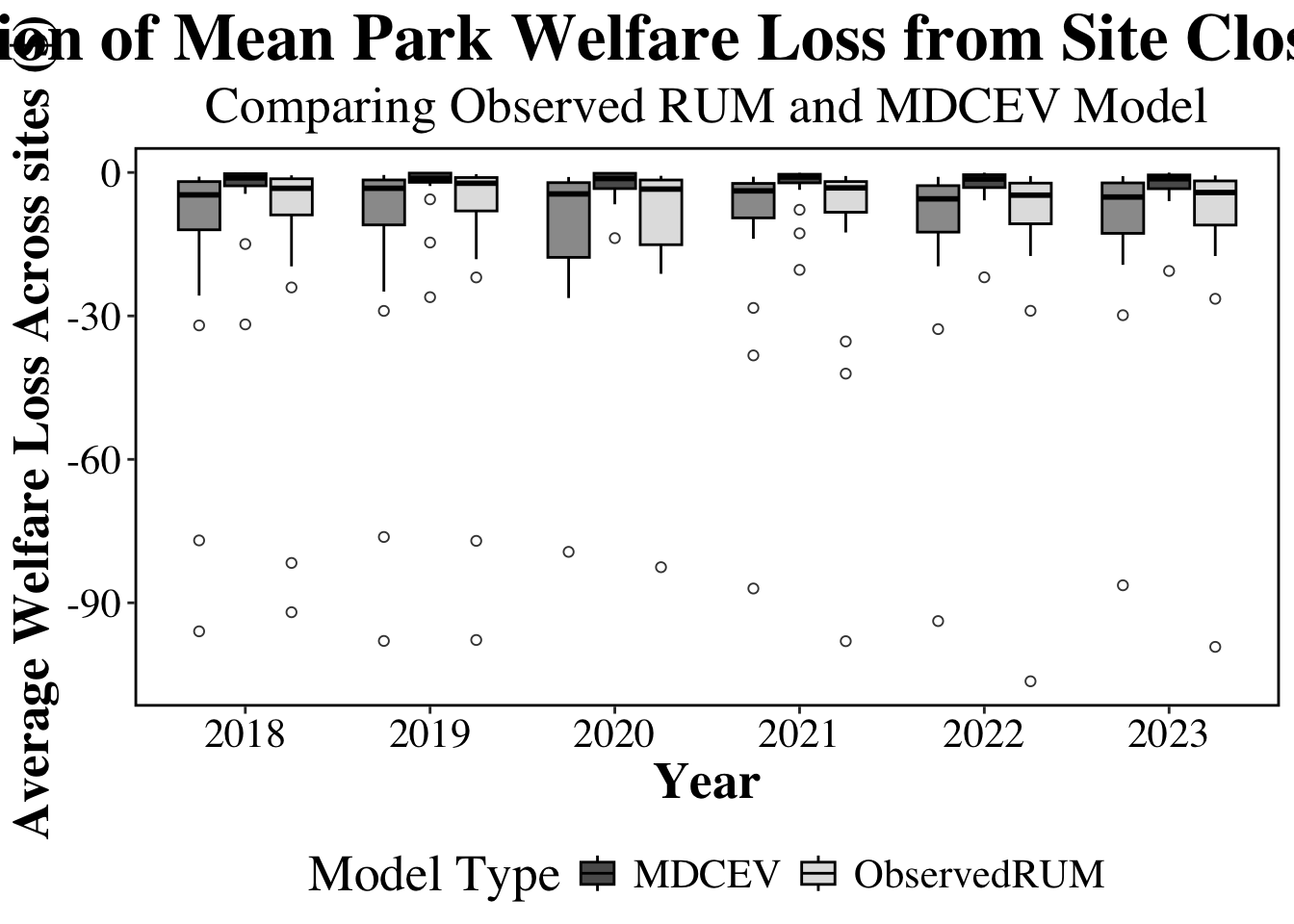
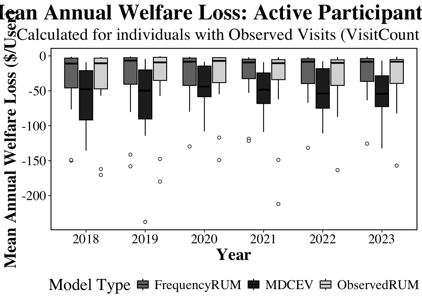
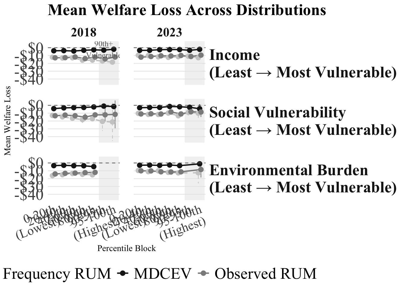
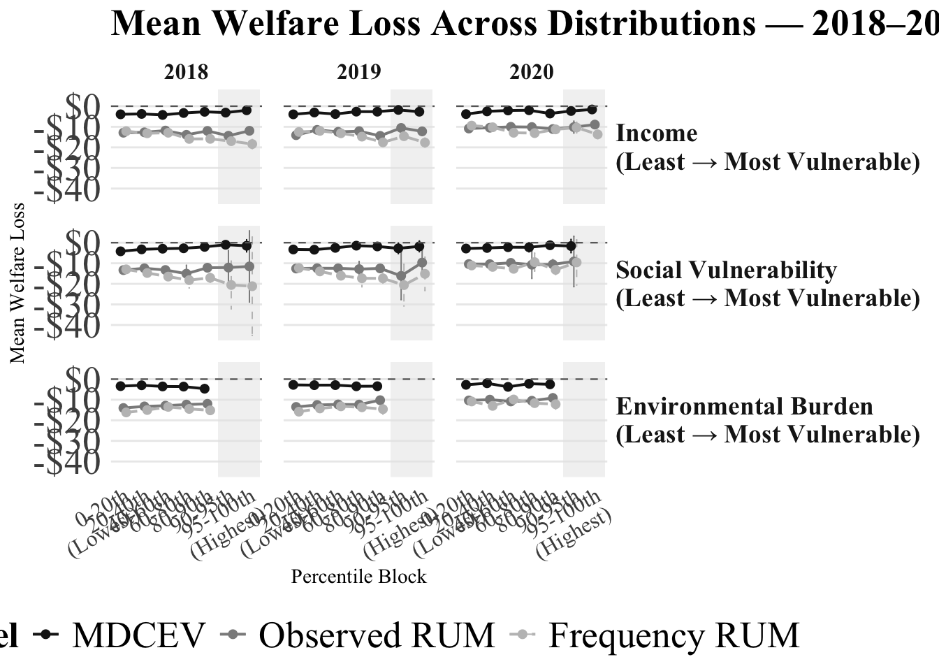
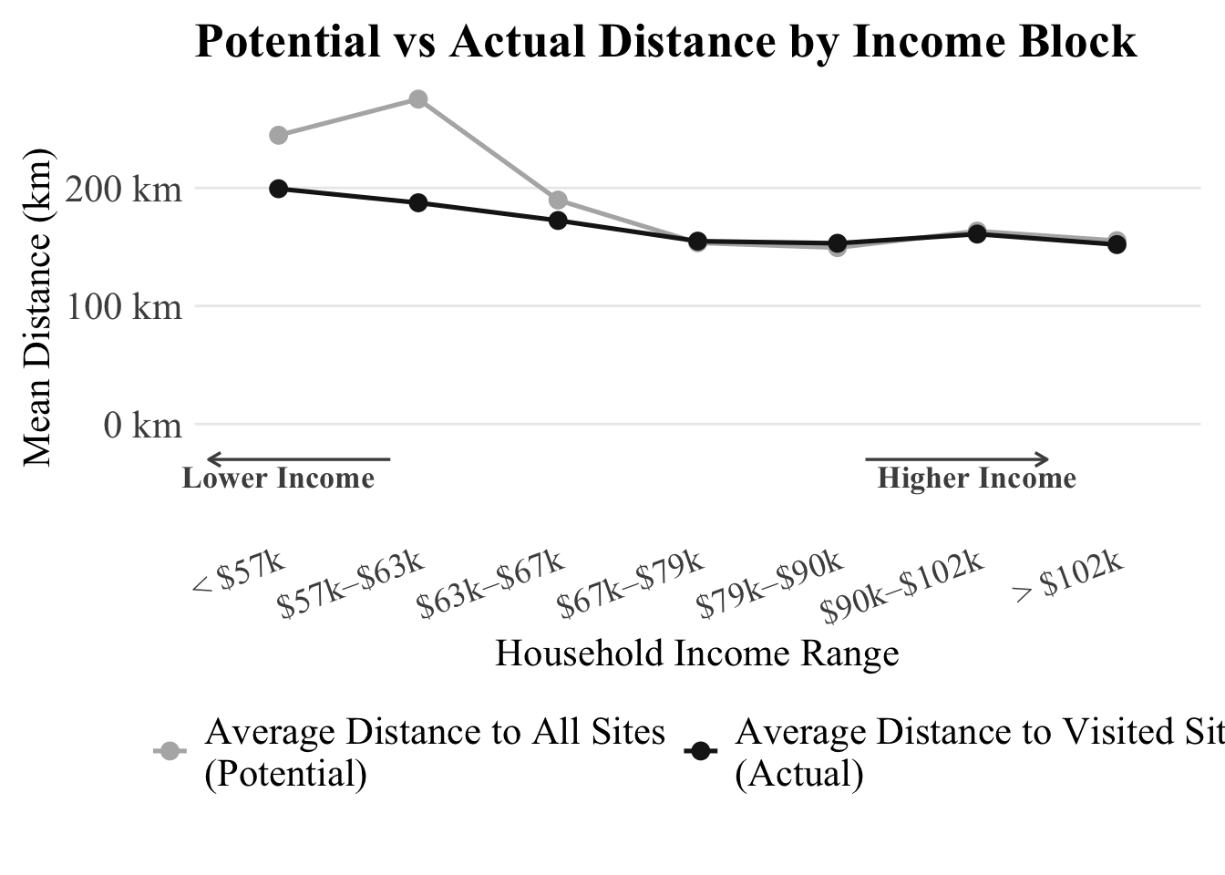
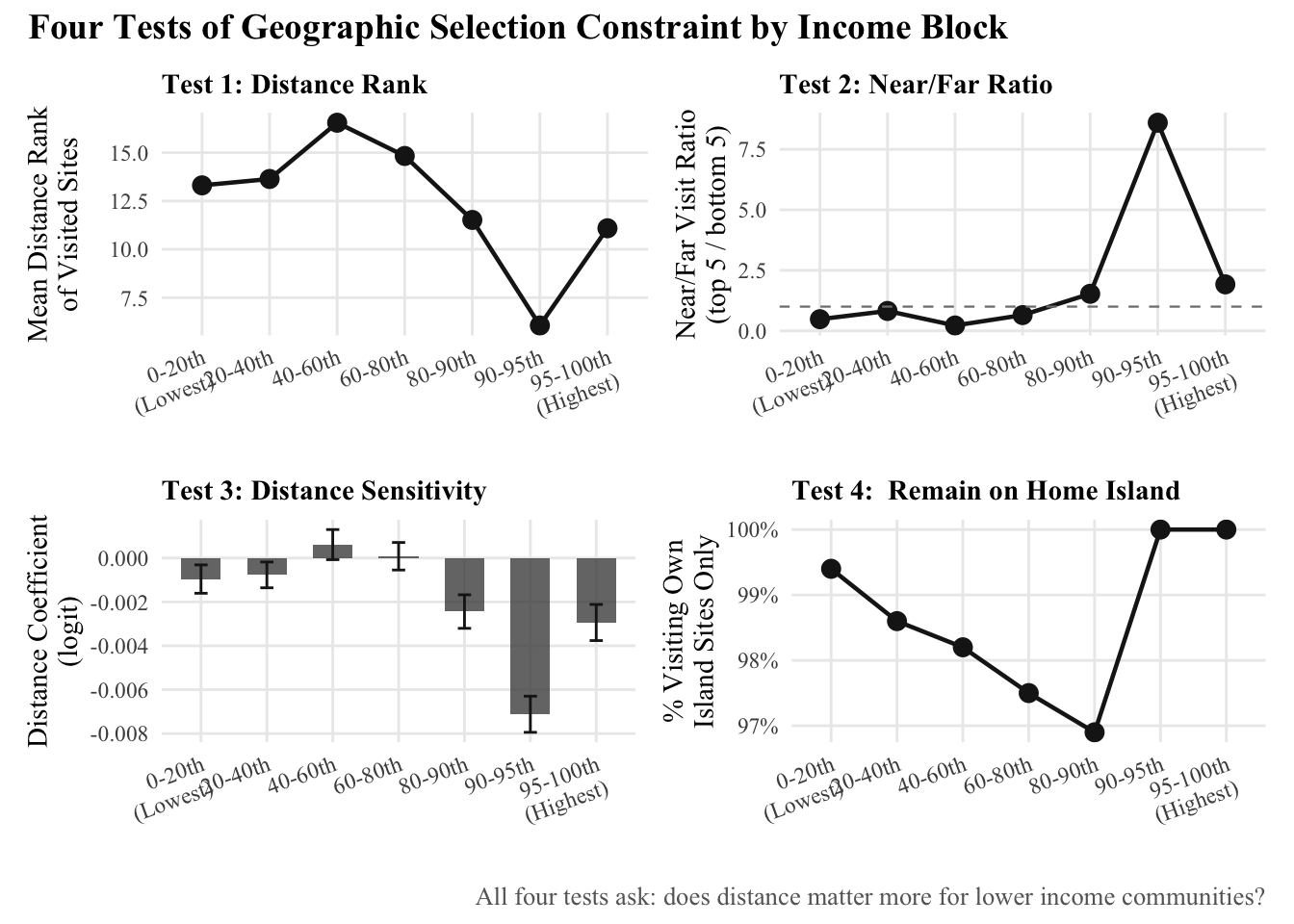
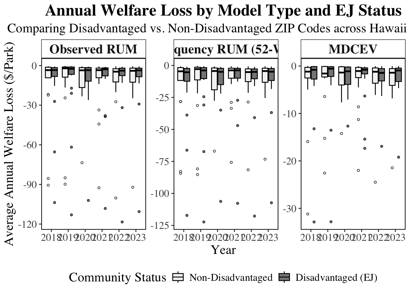
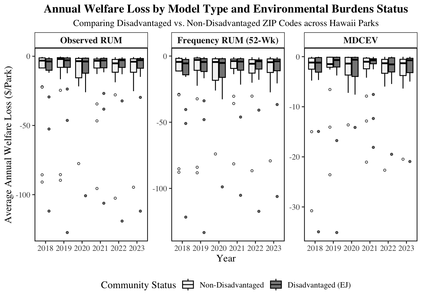
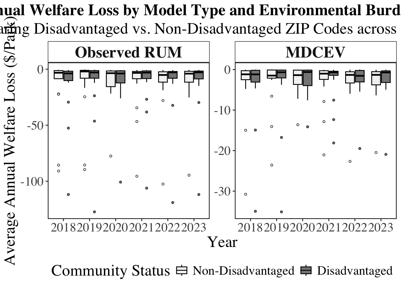
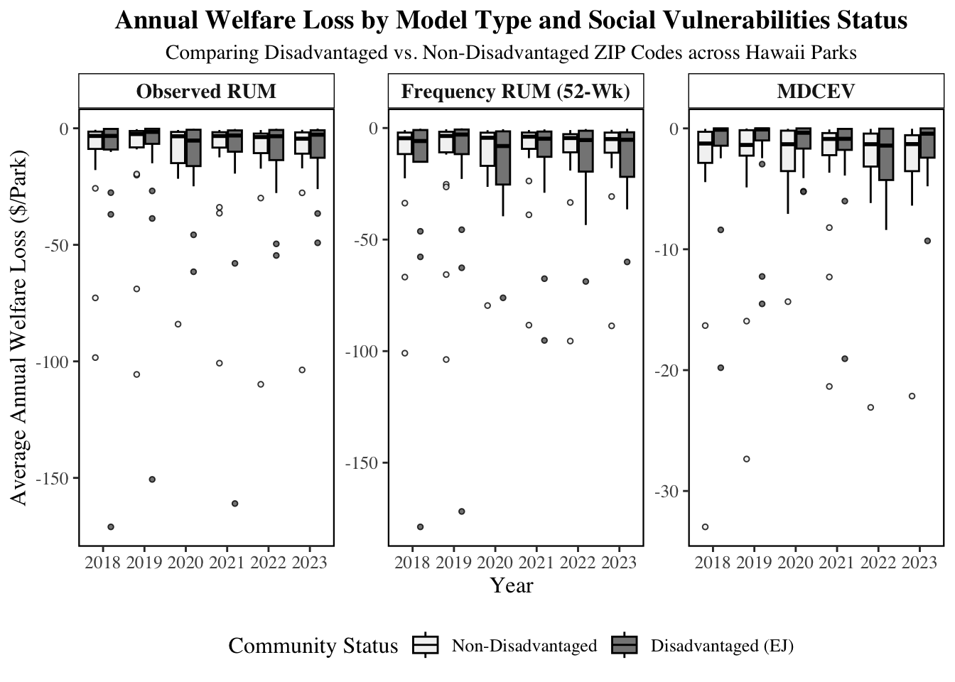
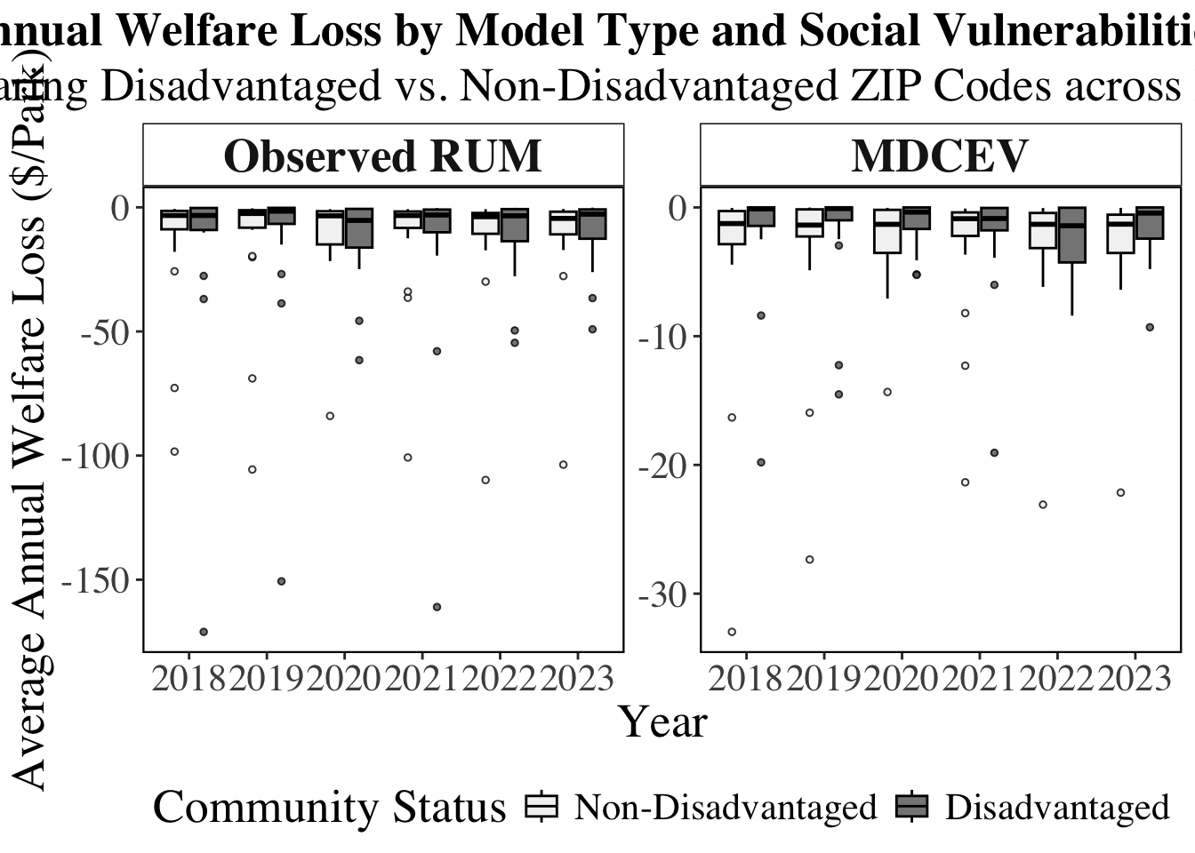
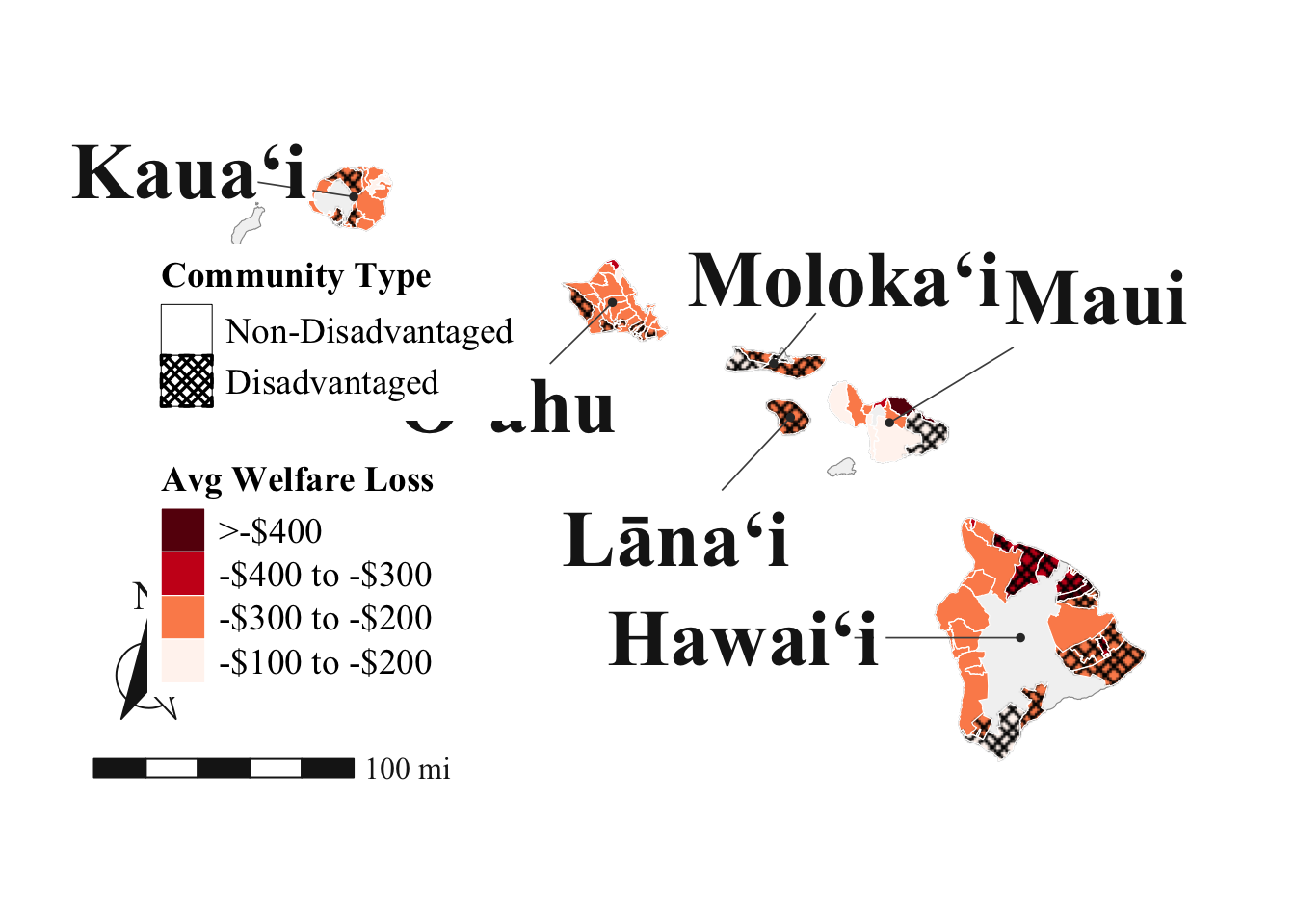
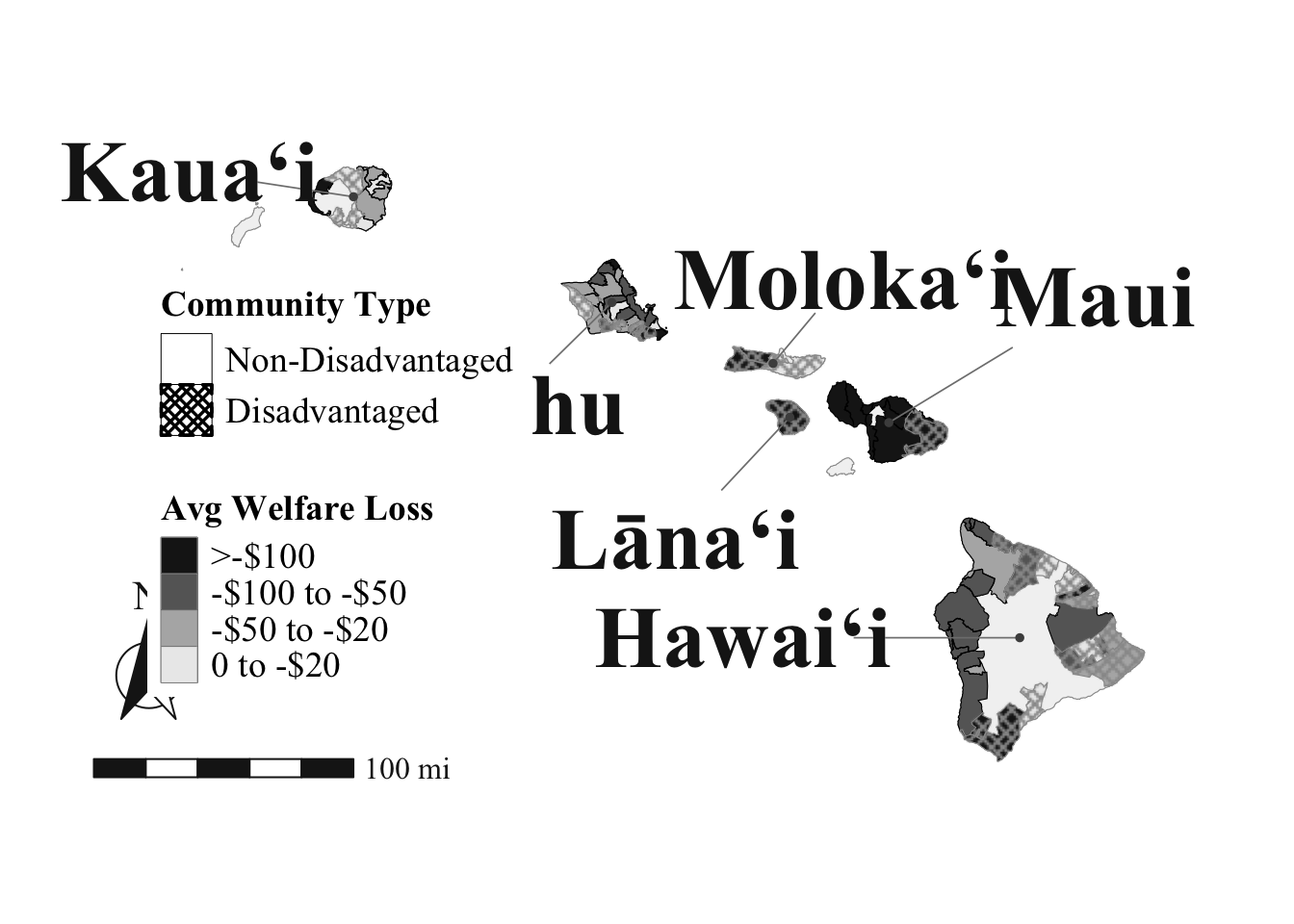
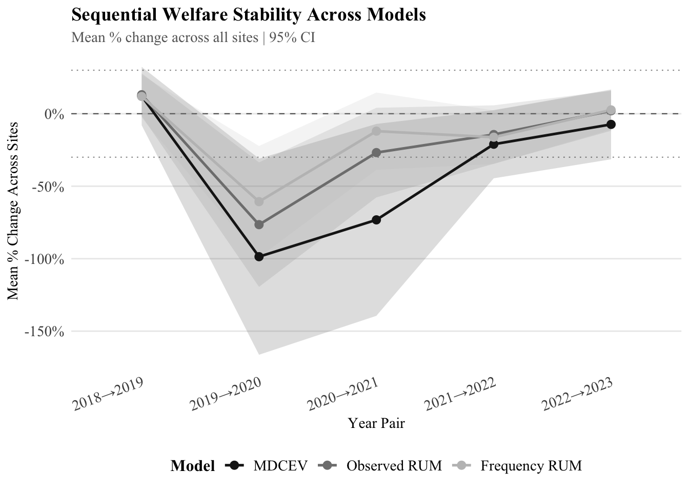
Social Vulnerabilities
Using EJScreen gives us flexibility where we can both examine the social factors and environmental factors. Here we will look at the social vulnerabilities of 90th percentiles within the state who are identified using :
Percentile for Demographic Index
Percentile for Supplemental Demographic Index
Percentile for % people of color
Percentile for % low income
Percentile for % unemployed
Percentile for % persons with disabilities
Percentile for % limited English speaking
Percentile for % less than high school education
Percentile for % under age 5
Percentile for % over age 64
Percentile for Low Life Expectancy